
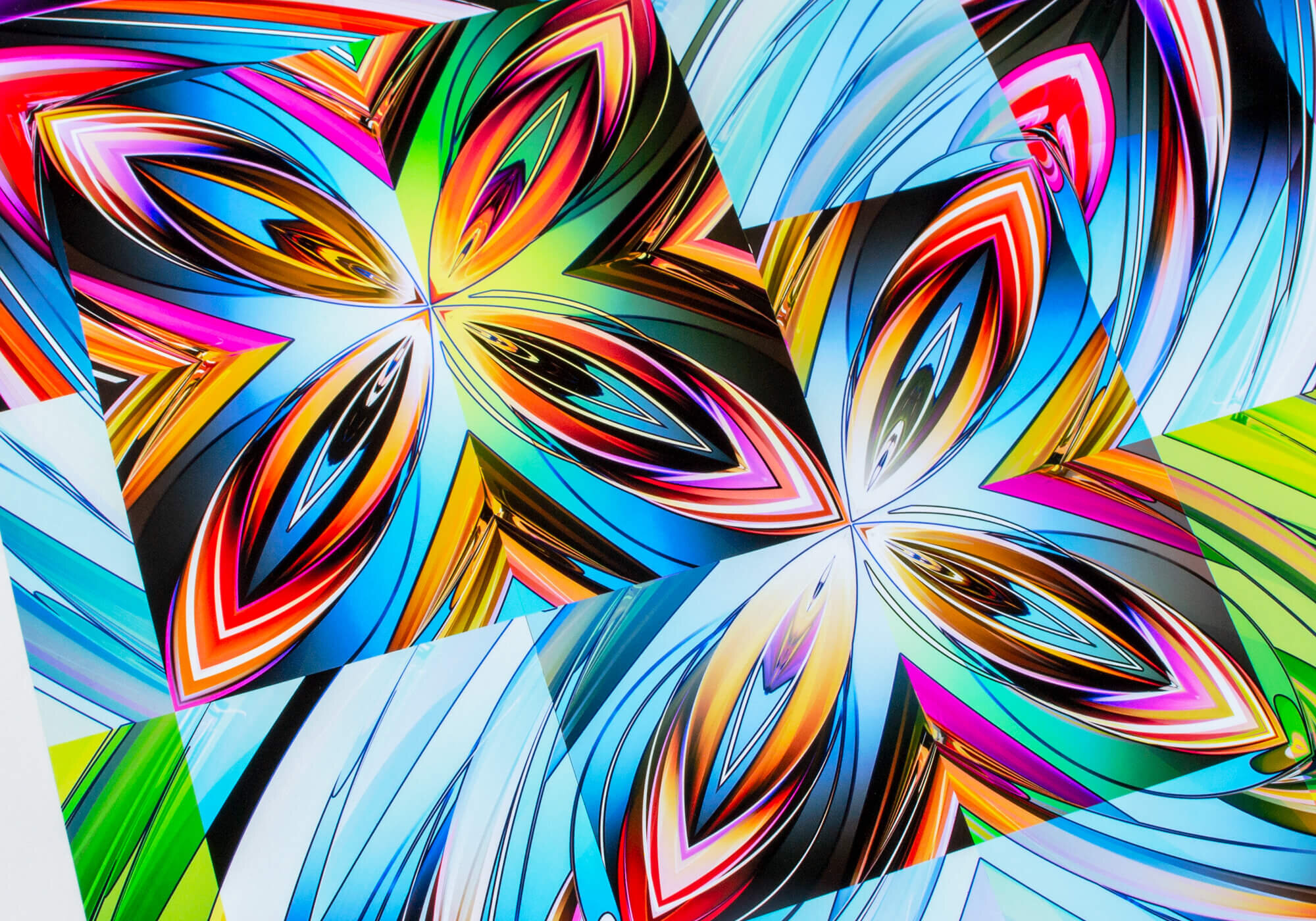
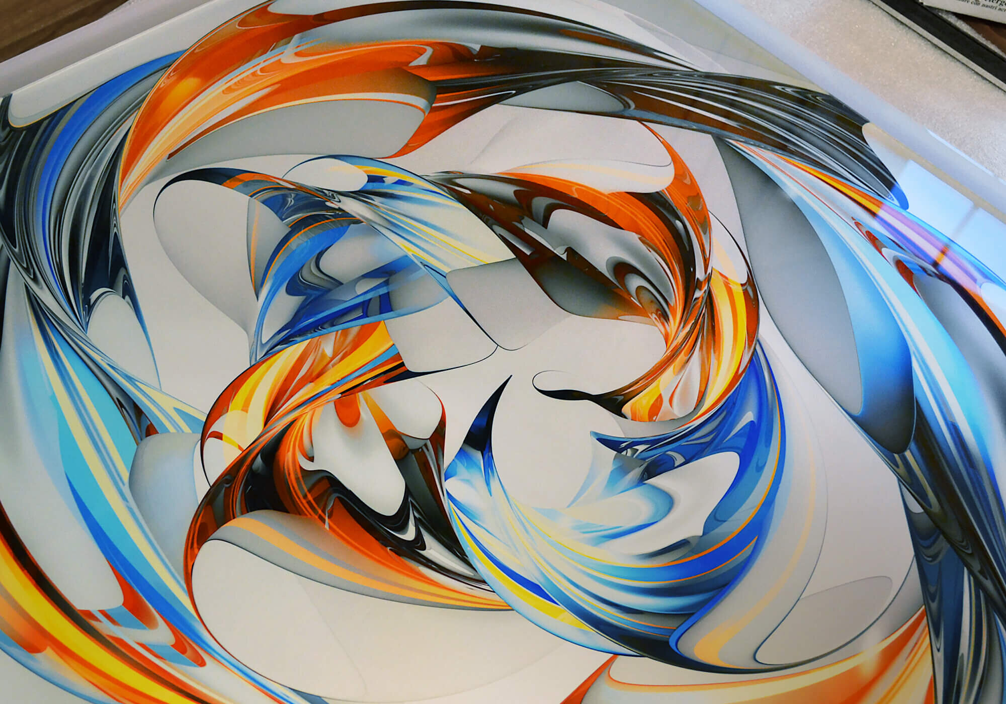
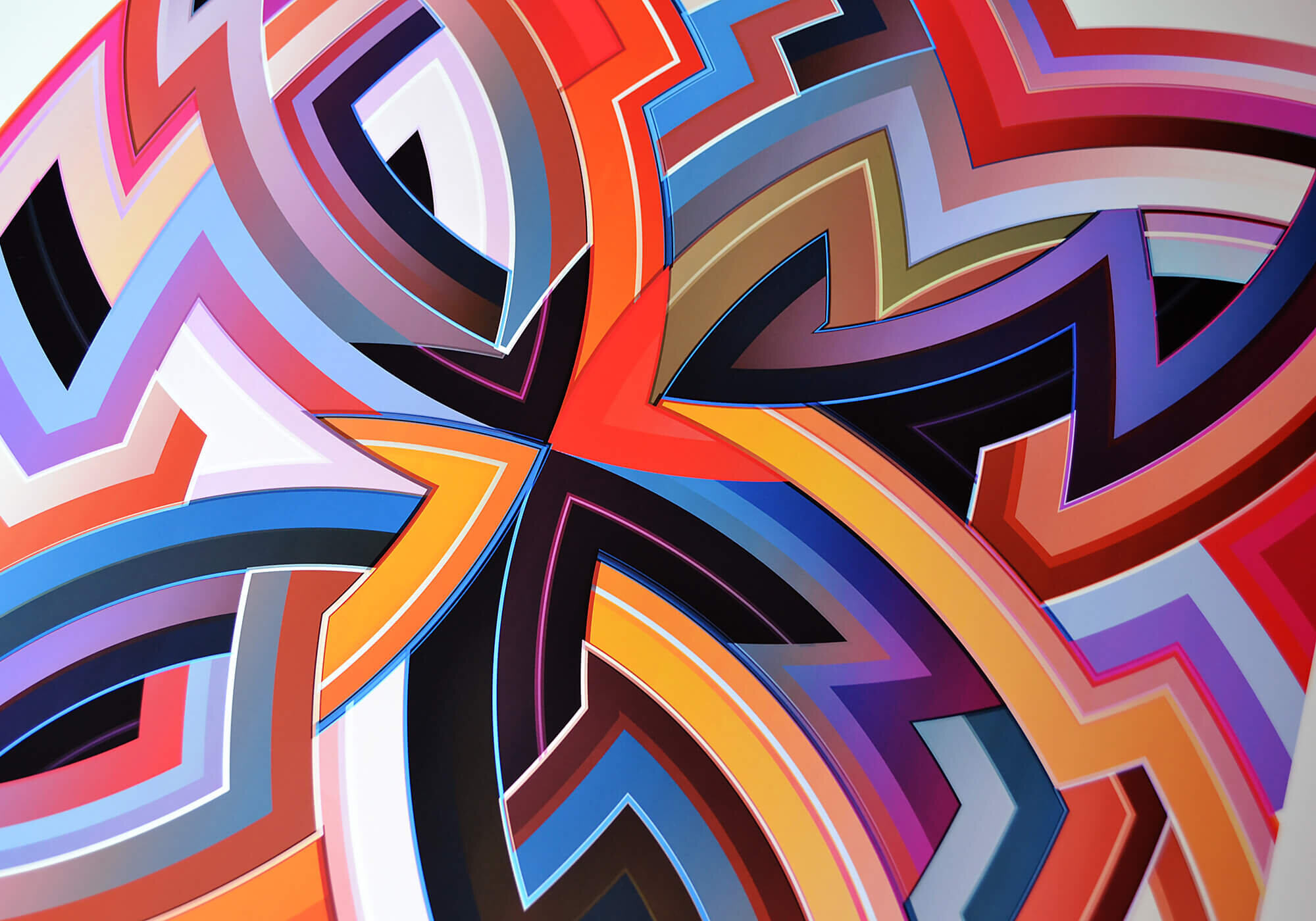
Digital Drawings
Digital drawing encompasses most of the work I've 'built' on digital systems to date. The completed drawings tend to be exposed onto metallic photographic paper using laser light, to produce large format colour prints. The works could equally well be thought of as cameraless photography or digital photograms.
Works on Paper
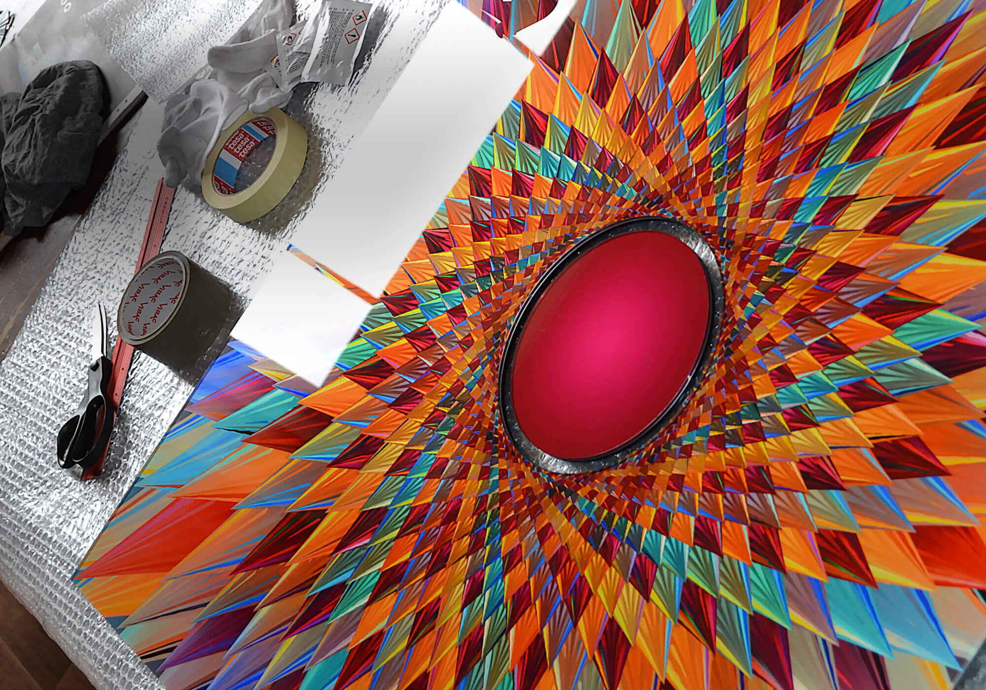
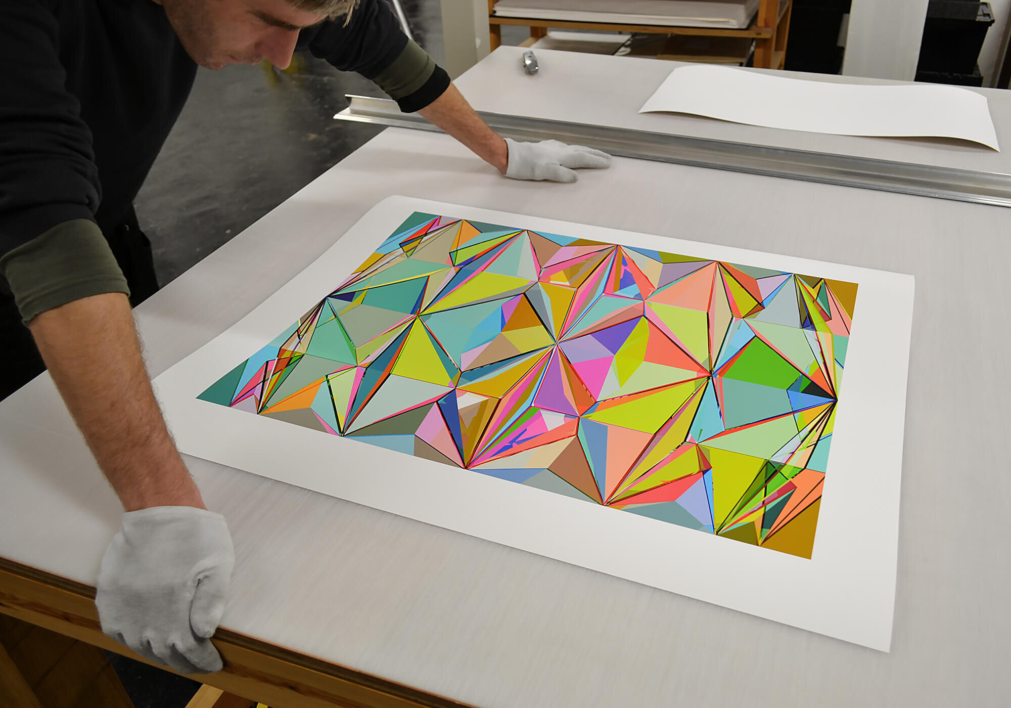
About five or six years back I decided to start making inked works on paper, experimenting with materials, processes and techniques in the studio here. Although superficially similar to the photographic works, there is of course a fascinating world of difference between light exposures in a darkroom and applying pigmented inks to paper.

Experimental Print Club
In 2016 I decided to start a print club using a monthly subscription model. The idea is to create smaller more ephemeral works, mostly on paper, and distribute them regularly by post. I hope the pieces extend the ideas and processes I've been using in the larger works, and cross pollinate new ideas with my main practice.

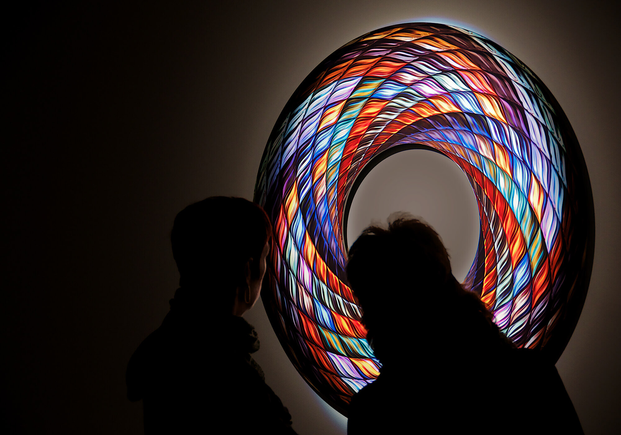
Modular Locus
A solo show of digital drawings at the Brewhouse Arts Centre in Taunton, curated by Freeny Yianni and Close Ltd. We opened just ahead of the Coronavirus lockdown, and closed days later!
.
The Brewhouse Gallery, Taunton
March 2020

Current at Catto
Current was my most recent show at Catto. Over the past decade we’ve put together three solo shows, a great two man show with Derek Balmer, PPRWA, and a number of group shows.
.
Catto Gallery
December 2017

Coda at Close
A solo show curated by Freeny Yianni throughout her sensational Georgian house and contemporary art gallery in Hatch Beauchamp, Somerset, with a show catalogue designed by Herman Lelie.
.
Close House
January 2011


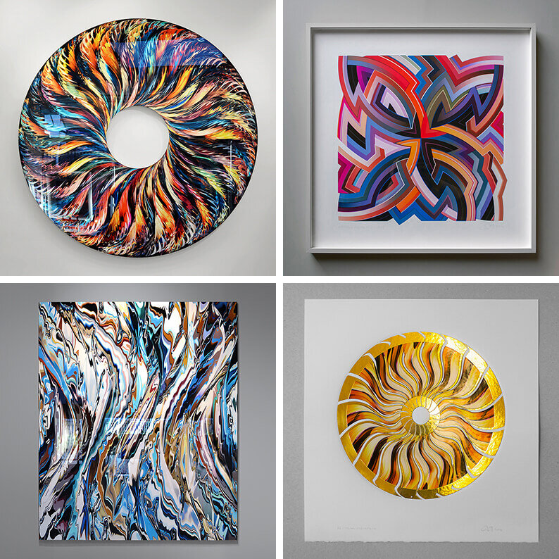


Psyche D / EvH
Psyche D is a wildly complex drawing, that free wheeled out of control as it went on. The study maps the idea of the cosmos as a fluid series of coloured components surrounding a becalmed central core, split into two halves, perhaps a kind of yin and yang, with a nod to Lewis Carroll. Optionally available mounted to Perspex and laser cut to shape.

Klint / JDRBNK
The Klint studio is an inspiration to anyone who loves paper folding and modernist design. So of course I couldn’t resist building a series of origami like structures for a new series of works about their history and style. Klint is optionally available mounted to Perspex, and cropped into 3 unequal parts to emphasise the horizontal joints of the original model.

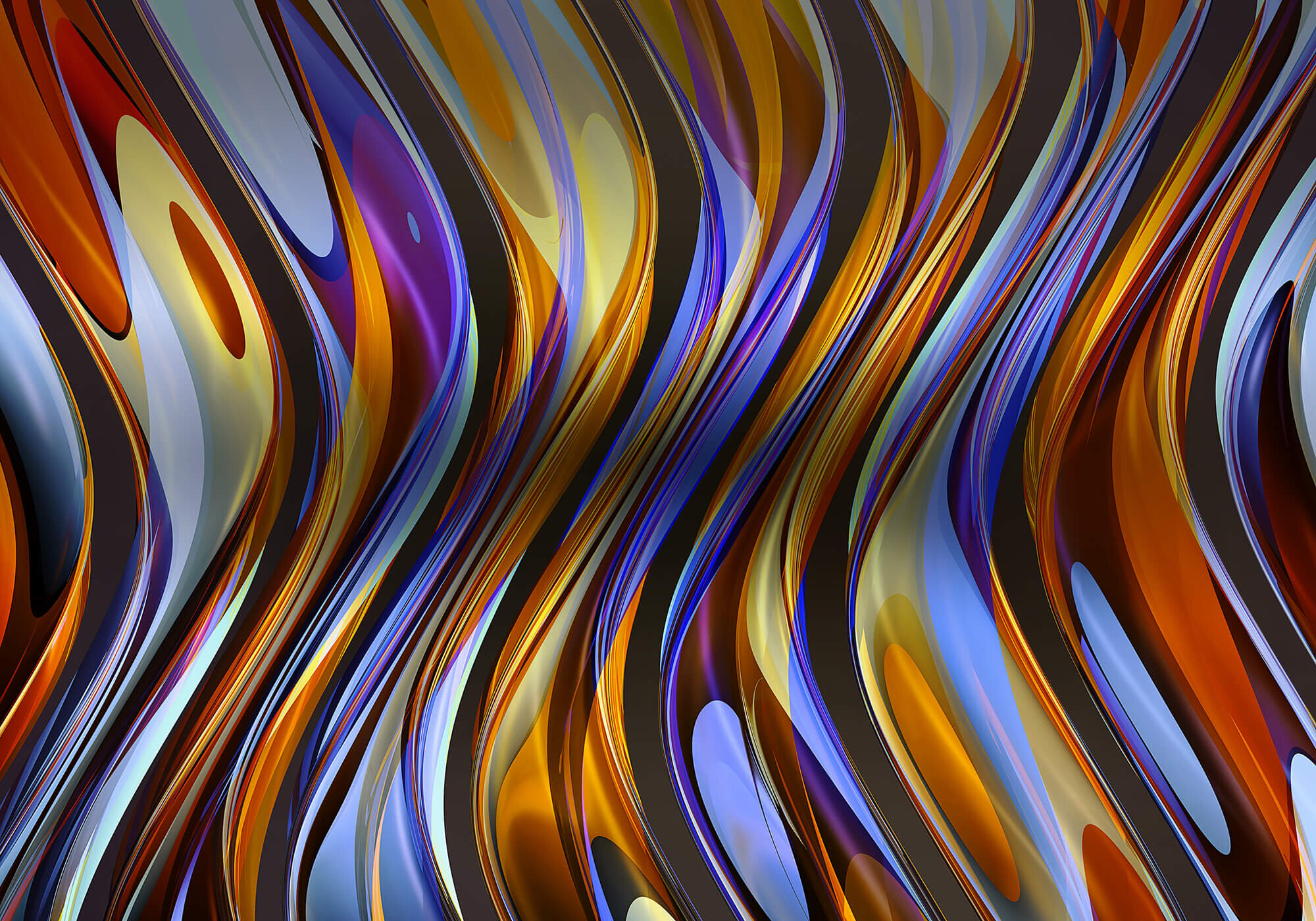
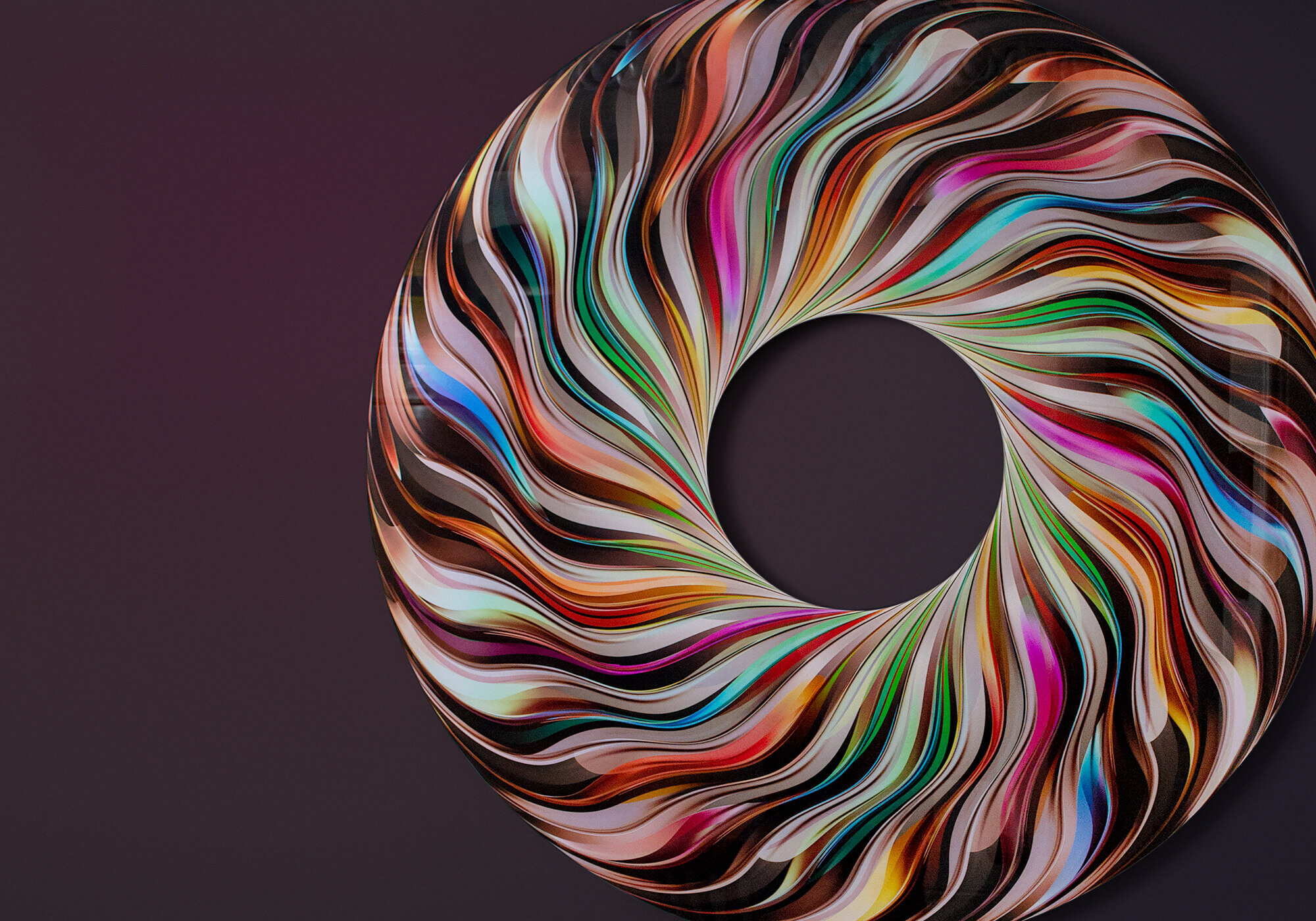
Halcyon / silver solar
Halcyon is a study in line, action and depth of field. The study comprises a dozen or more curving lines entering into and out of the image space, expanded to varying degrees as they travel. The depth of field creates a central focal point for the eye, surrounded by varying levels of diffusion as the linework travels around the core.

Millefiori DMG
Millefiori / DMG is the next logical, or perhaps illogical, step towards trying to capture some of the light, life and vibrancy that you find in studio glass, inspired by a visit to Murano, and the millefiori works made there.

Lyric SV
The Lyric SV works, or systematic variations, progress the studies further using a new, more liquid, more lyrical, drawing technique, that I hope creates a painterly quality.

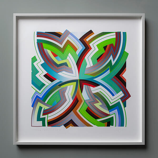
Arpeggi / FOLIO
The Arpeggi series of drawings seemed to lend itself particularly well to the idea of being recoloured, and so after some experimentation, I settled on the idea of making six variants, presented in a clam shell folio.
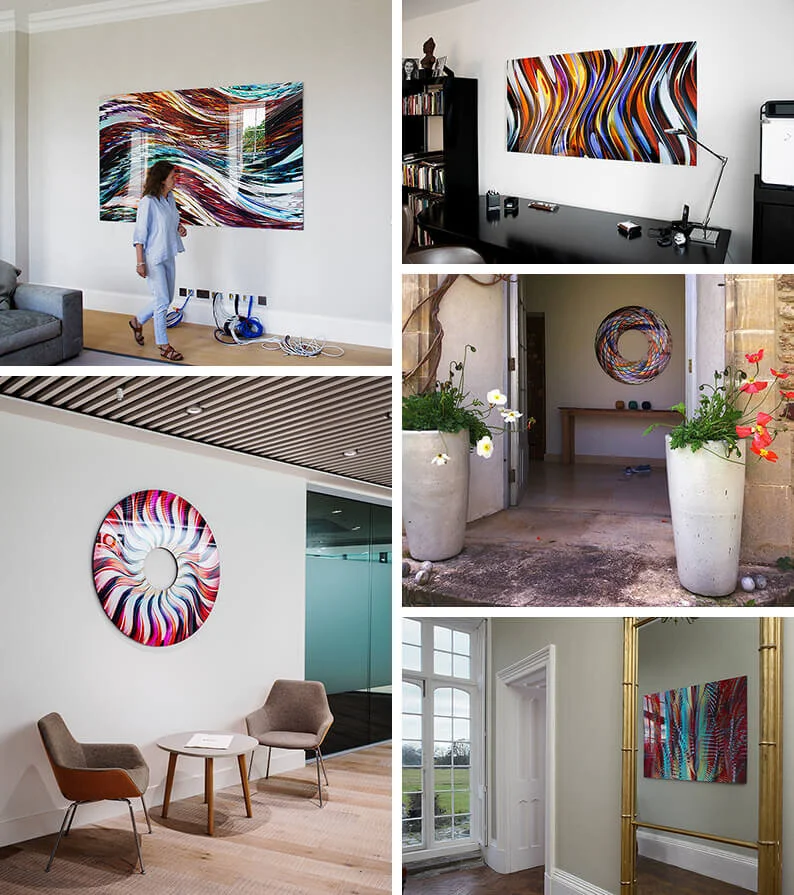
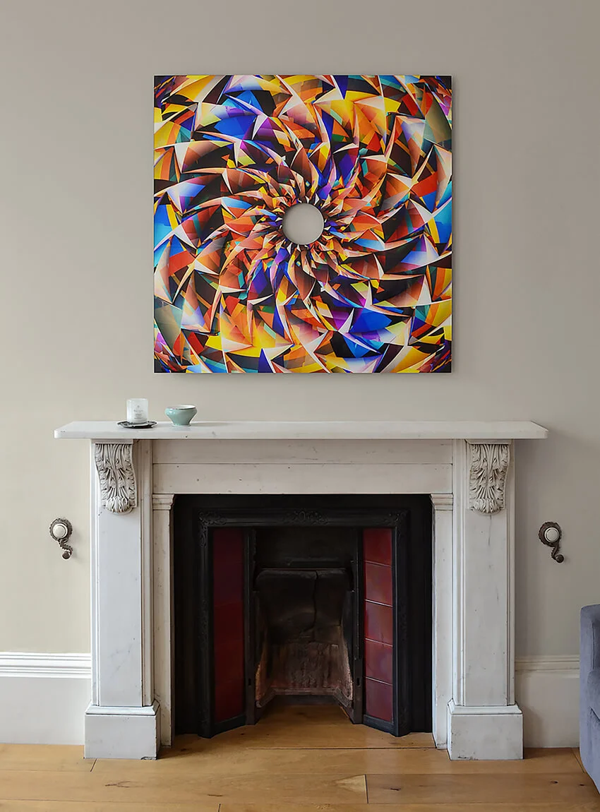
An apartment in Bath
Bath is the town I grew up in, so it was always going to be a treat to do some work there, especially in such an amazing apartment as this one. Previously used as student accommodation by Bath School of Art, the house has been refurbished and modernised for residential use. Amazing, on reflection, to be given an opportunity to produce a set of artworks to run throughout the whole apartment, a total of eight pieces in all.

Collider in Belgravia
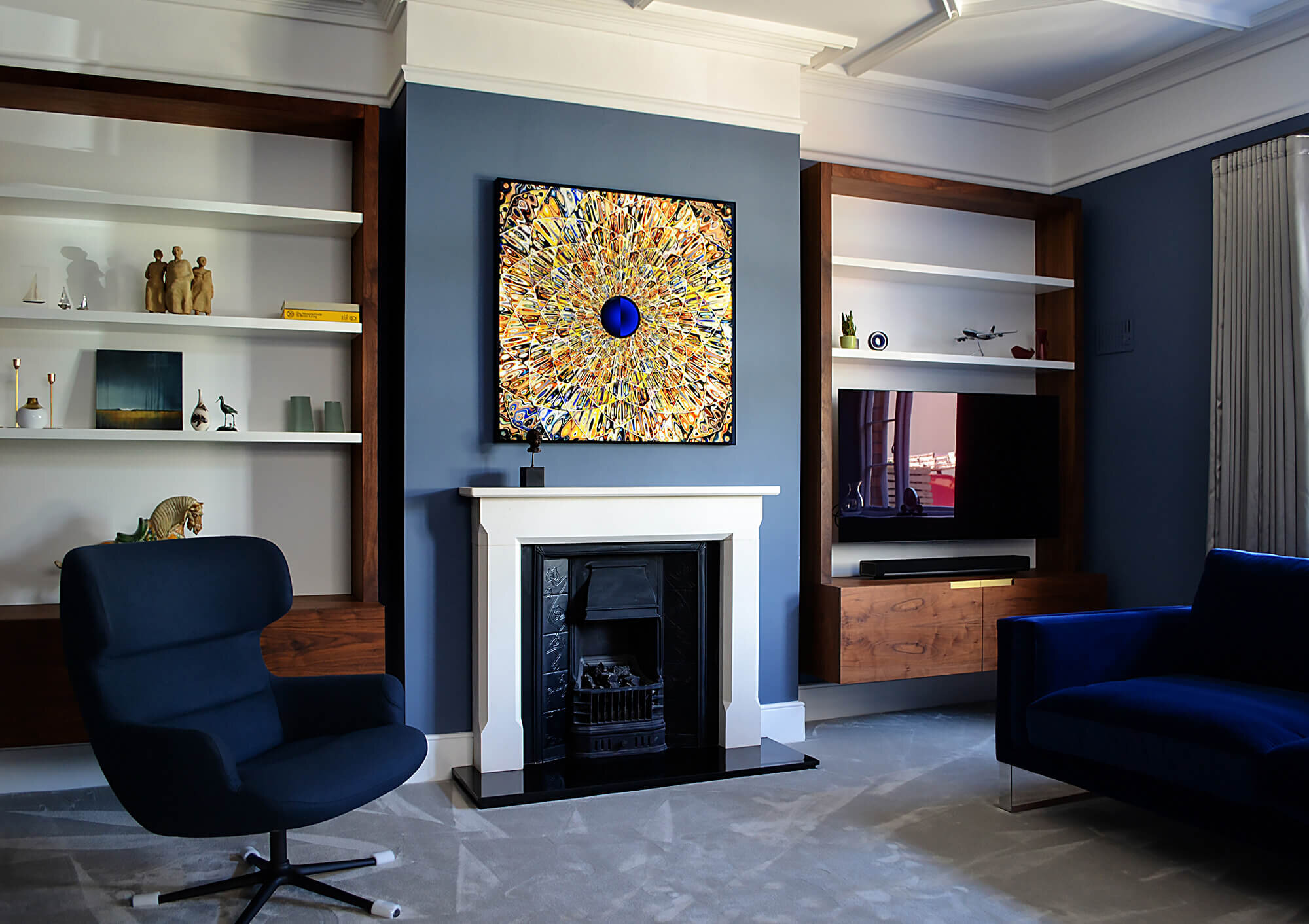
Originally conceived as a kind of electro mandala, and a meditation on the Fibonacci numbers, Collider / gilded mandala seems to be able to inhabit this extraordinary London dining room without too much difficulty. Intriguing to wonder if the context changes the work, or if the work has changed the context, perhaps neither or both, I'm not sure!

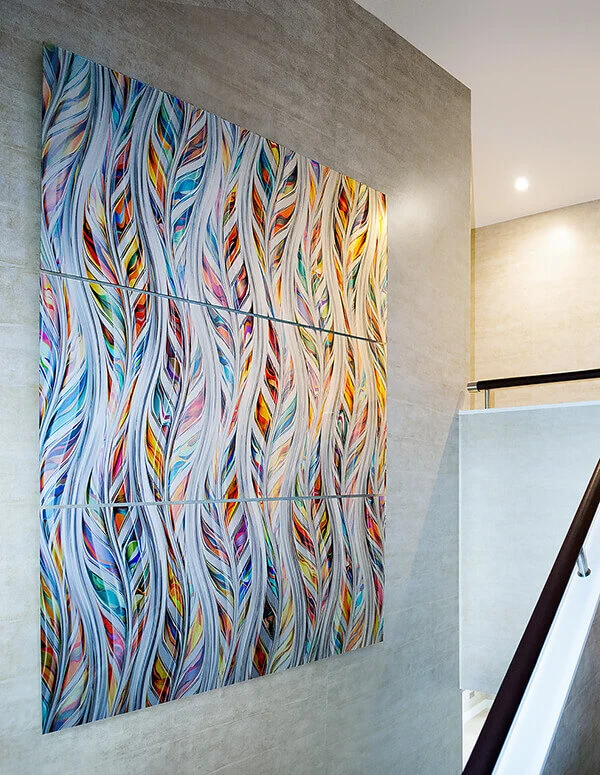
A house in Bristol
There's often a serendipitous aspect to the work I make, that can manifest in really unexpected ways. So it was with this lovely opportunity to produce three bespoke works for a spectacular home here in Bristol. I was invited round to view the project, maybe halfway into what was clearly a major refurbishment, involving a significant new build extension that was being grafted onto the body of a substantial Edwardian home.

Work / Experimental Print Club /
Hive / duality : singularity
I’ve been working on a new series of drawings called Hive. It’s currently unclear exactly how these studies are going to ultimately manifest themselves, but I suspect it’ll be as a series of large format panels, possibly in sequence. For the moment however, I thought I’d print a single, smaller component of the series as a new piece for my Experimental Print Club.

Work / Experimental Print Club /
Paean / one day in May
Paean is my first free standing print edition, a mantel piece if you like. I also wanted to celebrate the advent of Spring in the garden we’ve inherited here. I continue to be interested in the idea of the studio as a physical space, and the specificity of that place. The studio’s output inevitably being coloured by its location both in time and space.

Work / Experimental Print Club /
R2 / helios helianthus
R2 / helios helianthus, the third print club work, is a re examination of my Radial / TWO geometry. For the print club edition, I wanted to experiment with some more complex laser cutting ideas, as there continues to be a fascination with the idea of cutting forms out of the print work, that will support or reflect the sculptural nature of the underlying drawings.


Lovely to be featured on the cover of Bath Life magazine, and delighted that the editorial team also chose to feature an image of the latest Print Club edition on the editorial page. Nice to see the print in print, if that isn’t too meta.

Chuck Elliott / 12
Sometime towards the end of 2019, I started working on a new book, broadly designed to catalogue some of my favourite images from the past 12 years. Beautifully printed by Ripe Digital in Corsham, the book features 100 large format pages, with accompanying short texts that I hope illuminate the project succinctly, and with a little humour.

Synaesthetic
Published in September 2011, Synaesthetic is a 110 page large format hardback book, produced by Transistor. It features interviews with Matthew Collings, Lynette Quinlan and Louise Copping, alongside in situ photography, artwork and associated ephemera from the first six years of the project. It’s available to view and download online. A short run digital print version can also be purchased from Blurb.com.

Coda at Close
Coda at Close was published to mark the opening of my solo exhibition at Close House in March 2011. Curated by Freeny Yianni, the exhibition featured around thirty works installed throughout the main reception rooms at Freeny’s stunning C18th home in Somerset. The 68 page catalogue features an interview with Matthew Collings and in situ photography by Stephen White. The catalogue was designed by Herman Lelie.
About / Interviews and essays /
The Chancy Element
In conversation with Matthew Collings
MC I can see the images are computer generated. I respond to the intricacy, rhythms, playfulness, but I’ve no idea what technical processes are involved. I see very beautiful visual relationships, and I imagine from their intensity that creating them involves a high degree of labour, as with any artistic process, and in fact, it’s basically drawing...?
CE Yes, every part of the image is hand drawn. But you could argue about whether what I do is really drawing or not. Both my brothers are artists. And we have a lively debate all the time. One of them tells me that drawing is always “pencil on paper.”
.
February 2011
About / Interviews and essays /
Modular Locus
In conversation with Freeny Yianni
FY Tell us a bit about your approach. How would you describe it? What are you looking for in a subject? How has your style developed, and what matters to you?
CE Sometime back in 1984 I saw, and used, the first Apple Mac computer to be imported to the UK. It was an important moment and one that resonates to this day. In that moment I decided I wanted to use digital tools to draw my work, as opposed to the more traditional media I was being trained to use. In some senses, you could characterise this as the difference between rock music and electronica. Rock music remains super relevant of course, esp the post-rock movement, but there seems to be space in the discourse for a more contemporary means of production too.
.
March 2020
About / Interviews and essays /
Artist in Focus
Blackwater Gallery
JA Your work is incredibly abstracted, we would love to know what inspires you to make these beautifully altered forms?
CE In essence, I’m working with the most basic of things, line, light, colour, and form, to create works that abstract ideas about the world that surrounds us. For me, despite the fact we’re all taught to work with words and language at school, the real world lives in my mind through colour and form, life is primarily a visual experience, not a linguistic one.
I hope the end results evoke some beauty and some kind of poetry. It’s not my intention to overpack the work with overt references and meanings. I like the idea that art exists in the space between the work and the viewer.
.
July 2020

Sun : Moon : Cosmos {67} SQ
Music, especially live music, often combines with an extraordinary light show, at it's best played out on a long summer evening lost in a field somewhere. In the year I was born, 67, there was an explosion of oil slide fuelled psychedelia, and at the time I drew Cosmos, I wanted to see if I could capture some of that light energy in a panel for the wall. Cosmos, therefore, pays more than a little tribute to the original freak out light shows of the first summer of love.

Arpeggi / REZ / cerulean japanned
Arpeggi / REZ / cerulean japanned can be viewed as a falling wall of water and makes some reference to the extraordinarily beautiful images of fish, often carp, produced as woodblock prints in Japan, over several centuries. Japanese woodblock printmaking remains hugely influential, incorporating as it does, amazing images of nature, with a use of line and colour that in many ways remain unsurpassed to this day.
Ascension
I’ve never been hugely into jazz, but a few years back I did start to dip my toe in the water. I guess Spotify helped with the process, as you can follow your nose down the rabbit hole if you choose to. Ascension combines a lot of ideas I was working with whilst listening to Coltrane, Bird and many others. No room for squares by Hank Mobley remains a good jumping in point if you want to get a feel for the kind of thing I was listening to.

Flow / turquoise base
A fair while after I made the original Flow series, I started looking at the idea of creating a new more saturated variation, with a fairly solid colour base, and after some considerable exploration, came up with this turquoise and copper palette. As is often the way with much of the work, I then put it to one side and ignored it for several years. In the summer of 2018 however, a good friend of the family turned 18, and so I offered him a print for his birthday, and after much deliberation, we decided to try out this study as a pigment print.

Dazzle / 12 bar crop
The Dazzle piece I drew for my 2017 show Current at Catto was 200cm wide, but the drawing seemed to offer an opportunity to generate a smaller work on paper as well. So after a little further experimentation, I cropped the study down to the 12 vertical bars that form the central core of the composition, and tried it out at various sizes on the Hahnemühle paper, settling in the end for this pigment print edition at 60cm high. I like the idea of the 12 bar crop, with its strong musical connotations.

Klint / reDux / acdh
Le Klint Studio is an inspiration to anyone who loves paper folding, contemporary design, and light. So, of course, I couldn’t resist making a series of origami like geometries for a new set of works on paper in 2015. The image I made is not an identikit line work, more an homage based around some of the origami like folds they use, with the addition of colour glazes and offset transparencies. I've also added a grid like structure of darkly shaded lines and accents, that brings the geometry to life.

Thanks for visiting my site, it’s appreciated!
It remains something of a work in progress. I hope it’s a little more fully featured than the previous offering, with better images, a lot more writing and a more comprehensive news blog. I’ve also incorporated my Experimental Print Club listing here too.
I’ve made it, in part, as a response to the Coronavirus lockdown and the realisation that showing work online is going to become more essential in the future. Building it has been an interesting opportunity to explore some of the latest web technology. I’m still very much using a hands on DIY approach, but perhaps with a little more confidence than my previous four attempts!
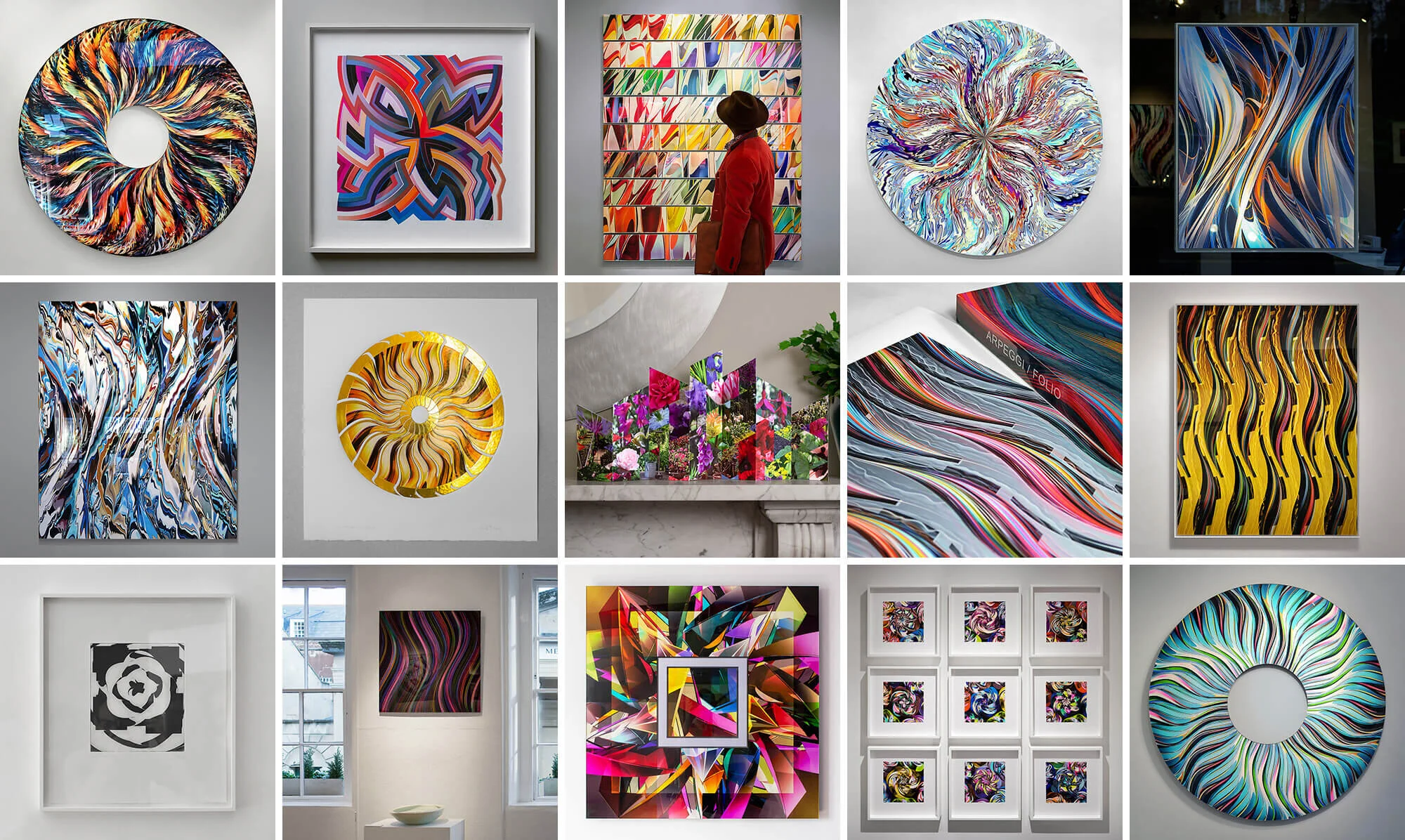
The best place to dive in is probably the Overview section, there are four pages with around 400 images of work, mostly photographed in situ, that are linked through to the project pages, exhibitions and publication listings. You can click on any image that catches your eye, and link through to find out more about it.
I’ve also built an eCommerce store here for the first time. As fairs have temporarily closed their doors, and the high street is locked down, there seems to be more of an imperative to offer work for sale online. So if you’re looking for a new work for your home or workplace, I hope you may find something of interest.
Finally, if you’d like to stay up to date with news about the project, why not subscribe to either one of my 2 regular newsletters. The studio newsletter has images of the latest work, alongside news and invitations for upcoming shows and events. You can subscribe here.
Or if you’d prefer more frequent in depth news, views and opinion from the studio, you should subscribe to my Print Club newsletter here.
Thanks for taking the time to have a look at the site and the work.
If you have any questions, would like to discuss commissioning a piece, or would like to ask about including work in an upcoming show, please do email me here.
I’ll look forward to hearing from you…
With best regards, Chuck