

In moments of crisis we often turn to data in an attempt to both understand the situation we are in, and to look for answers of how to escape.
In response to COVID-19, governments around the world have employed algorithms, used data from apps installed on our phones, alongside CCTV, facial recognition and other data gathering tools to fight the pandemic. Data is being used to drive the daily movements of billions of people in a way that many of us have never before seen. People are being instructed to stay home, go to work, wear masks, or send their children to school based on the invisible hand of data.
Yet 2020 has also highlighted the dangers of this. The interpretations and collection of this data are not without their problems – doctors and politicians looking at the same data can draw wildly different conclusions about the right course of action.
Without doubt, we should be harnessing all the tools we can in the fight to save lives, but the pandemic has also brought many issues with data mapping to the fore. COVID-19 disproportionately affects the poorest people in many countries, as well as black and Asian communities. This is is no small part due to data-driven regulations designed to stop the spread of the disease; often modelled on assumptions made by the people who design and run them.
These inequalities already existed, but models that slow a spread through the closing of offices, reduced transport and home schooling put enormous pressures on the poorest and most vulnerable members of society, who are not privileged enough to change their working or living arrangements. As digital technologies are further introduced, such as mobile track and trace, these communities will be marginalised even further. Even in the richest countries, those without a smartphone will be missed from any digital tracing apps designed to protect people.
Read more: Northern lockdowns shine a light on Britain's landscape of inequality
While these practices are newly confronting to many, such technologies – and their failings – have long been used to shape the lives, and deaths, of millions around the world. In the digital age, mapping and data continue to be seen as a fix-all. More people than ever are subjected to having their lives dictated not by elected officials, but by black box algorithms, maps, and data visualisations. As our attempts to hold the pandemic at bay continue, we must look at lessons from other crises and push for a more just world.
To do this, it is crucial that people understand the slippery quality of data. Statistics seem solid to many people. But data can mislead, and understanding how this happens is a huge step in the right direction of using data to improve the lives of millions of people around the world, and to tackling global crises such as COVID-19.
There are three main issues with data.
This article is part of Conversation Insights
The Insights team generates long-form journalism derived from interdisciplinary research. The team is working with academics from different backgrounds who have been engaged in projects aimed at tackling societal and scientific challenges.
1. Dark data
The first issue seems on the surface the easiest to fix. Dark data refers to data that is not collected at all. Many people believe that if we collected enough data about everything then we could solve any issue. Yet it is impossible to collect everything: there will always be dark data.
We don’t, for example, collect data about or from children in the same way as adults because of laws around consent. Data is often collected through tools that are not available to everyone – mobile phones share huge amounts of information, but not everybody has a phone.
The real trouble comes due to what are known as epistemic and ideological assumptions. These assumptions mean that even with the best intentions, we cannot gather data about things that we assume we do not need, or that we do not know that we need data about. Stark examples include how frequently women are excluded from trials and testing, either forgotten about, or based upon assumptions they are the same as men. This can have deadly consequences.
At times our biases also push us towards not collecting data that we sense goes against our own interests or views of the world. A surprisingly powerful urge to retain our status quo paralyses us from breaking through this barrier.
2. Data positivism
The issues of dark data are closely linked to another issue, known as data positivism. This relates to what we do with the data we have captured.
It is all but impossible to present all the data we find. This might be because we have too much of it, or because we are trying to tell a specific story with our data. As we turn the data in to maps and visualisations, we must make choices about what is and isn’t included, which often takes the form of prioritising one type of knowledge over another.
Data that fits well with traditional mapping practices will be more likely to be included on a map than other forms of information. This can turn extremely complex and competing sets of ideas into overly simple sets of data, which in turn is transformed into an even further simplified data visualisation. These visualisations are rarely questioned, because the way they are made is beyond the expertise of most people. The expertise of the creator is trusted wholesale – they create a false sense of certainty, but one we hold on to, especially if they reinforce our status quo.
3. Data washing
Then there’s the issue of data washing. Let’s assume that you have avoided the problems of dark data and collected everything, including the data you didn’t know you needed, and that you have navigated data positivism in the cleaning and preparing of your data.
You then come to present your findings. Perhaps they don’t really show the story you wanted, or show the opposite of what you thought – what do you do? Do you tweak things so they look different? Do you skip that diagram and move to another that shows something closer to your hypothesis? Do you choose not to share anything at all?
These seem like easy questions to answer, easy to stay on the correct side of ethical practice. But even with the best of intentions we can dismiss our own data when it doesn’t conform to pre-held assumptions. We might tell ourselves we must have made a mistake in data collection, so shouldn’t share it. Or we might think: that doesn’t tell a good story, I’ll leave it out. Or perhaps: this should be more dramatic, I’ll change the colours and design to make it pop.
These are not always disingenuous, but these seemingly innocent decisions conceal or obscure data and knowledge. They are hard to avoid even with the best of intentions, and when it comes to issues of controversy, the best of intentions is often left wanting.
In turning people into pure data, life and death decisions are made about people without their consent. These are the dehumanising effects of an algorithm-driven world.
Lessons from history
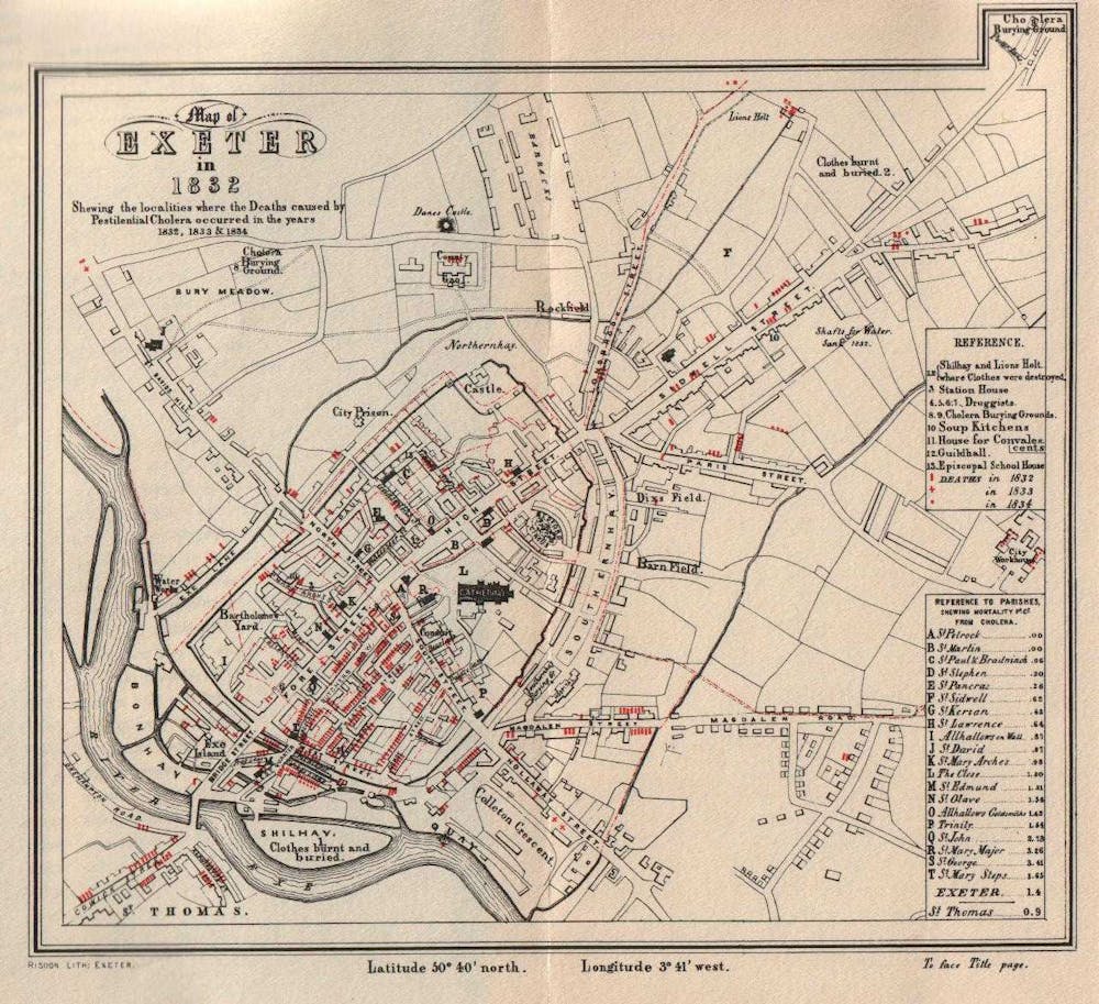
Mapping and data visualisation have long been used in times of crisis to help us make sense of what is happening, and to find ways forwards that might preserve lives and create a better future. Prominent examples include Thomas Shapter’s 1832 maps of cholera in Exeter, UK, followed by the more famous maps of cholera deaths produced by John Snow in London. These maps and their authors were credited with bringing new understanding of waterborne disease and saving many lives.
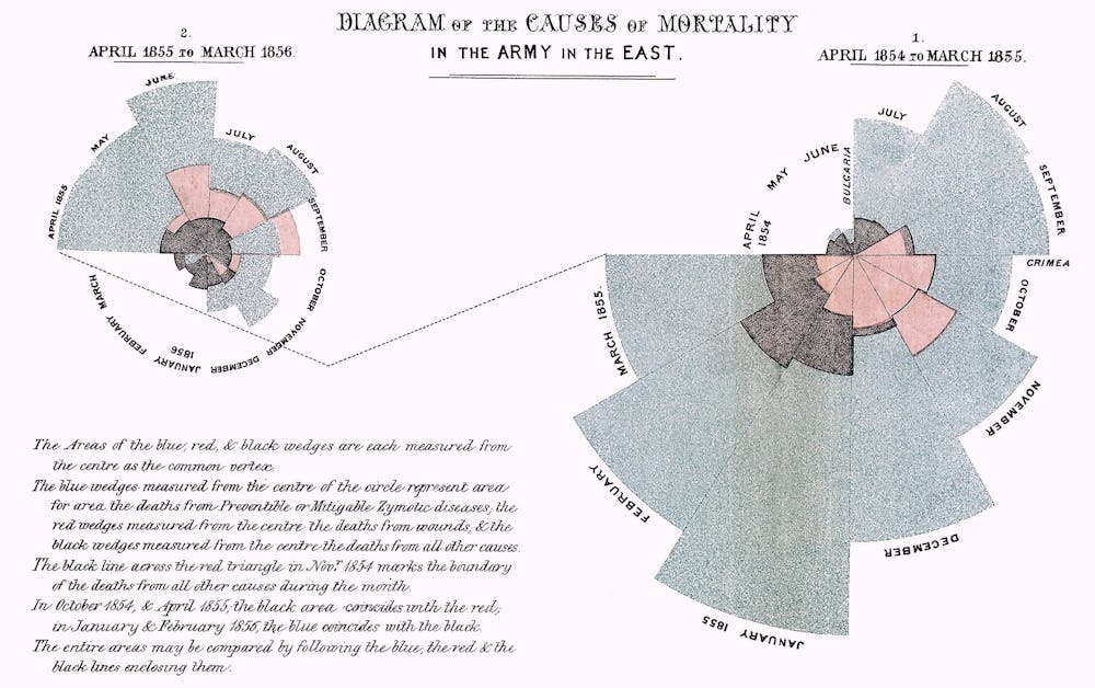
Florence Nightingale, whose name was given over to the emergency hospitals constructed around the UK in the wake of COVID-19, was also a statistician.
In 1861, as part of her consultation to the US army about care for Civil War casualties, Nightingale made data visualisations, and a lot of them. She created bar charts, stacked bars, honeycomb density plots, and 100% area plots.
Nightingale’s data visualisations were not about just showing what was happening, they were designed to call for change; to indicate required reform. She also invented a new type of chart to help her arguments: a comparative polar-area diagram known today as the Nightingale rose (she called them “wedges”). Her most famous diagrams showed the changes in survival rates of patients following sanitary improvements, such as washing hands regularly, and emphasised the effectiveness of these improvements by difference in size.
Nightingale, Shapter, Snow, and many others have used charts and diagrams to build graphic arguments and easy-to-understand comparisons that saved many lives. But when looking back at them, we often only consider the final product (map or chart), rather than the process of their creation. Yet at the time, these works were widely dismissed, and often misinterpreted as supporting the prevailing thoughts of the period.
There were many who did not want to enact the reforms proposed by Nightingale, although they are now seen as transformative in how hospitals are run. And Snow’s maps became more famous than Shapter’s not only because they were of London, but because of the evocative story of him striding onto Broad Street and tearing off the handle of the community water pump. What’s forgotten is that this act was required precisely because his data and mappings were initially misinterpreted by those who chose to see Snow’s maps as supporting their own theories – an example of confirmation bias where we read data in a way that suits our own views.
Both Snow and Nightingale saved countless lives through their data work, but even they came up against many of the issues of dark data, data positivism and misinterpretation.
In the digital age, where data is collected on a massive scale, often without consent, and is increasingly organised, sorted and interpreted by computers and algorithms, data has become seen as both a fix all for everything, and a dangerous commodity. The use of data to track people and dictate their actions can mean the difference between life and death in a very real and present sense. While that has been made clear to many of us in relation to COVID-19, there are many more stories of data, crisis and the fight for survival.
In our new book, Mapping Crisis, we look at the experiences of those who have been mapped or had their complex lives reduced to data, aerial photos or reports. From this we are able to draw out better ways of working, and better understandings of the various effects the secret world of data has on our everyday lives.
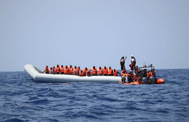
One of our examples is the case of the Mediterranean migrant crisis.
Life, death and data
The Mediterranean Sea is a place that for many conjures images of sun-kissed beaches, fine waterfront dining and turquoise seas. But this stretch of water is also one of the most heavily policed in the world. All movements in the region, whether deemed legal or not, are extensively mapped and monitored by the European Union.

While individual countries on the Mediterranean have long fortified their borders, the formation of the EU effectively created a single border along the northern shores. Since then, European states have continued to put in place an ever more comprehensive, and complex, system for monitoring and exchanging information about irregular migrants trying to reach the continent.
Running under the label EUROSUR, the system combines high-resolution satellite images, long-endurance drones, automated vessel identification systems and seaborne military radars that allow for situational reports and risk analyses in next to real time. These reports give daily updates on “successfully” intercepted migrant vessels.
But this highly sophisticated tool of mapping the movements of migrants is only interested in those who are stopped. The extensive databases held by EU states hold next to no information about those who die or go missing as they attempt to seek refuge. Those who make it onto European shores, by contrast, are rigorously screened for biometric data, including electronic fingerprints, iris scans and medical checks, and also for personal details about their lives to verify their identity.
According to the International Organisation for Migration (IOM), more than 19,000 people have drowned or gone missing on their way to Europe over the last decade. These figures are only estimates: there is no comprehensive system in place to document migrant fatalities across EU member states. European governments do not consider migrant deaths part of their legal responsibility and so do not keep a regular track record of them. This leaves humanitarian agencies like IOM dependent on eyewitness accounts and reports from search and rescue NGOs, medical examiners or the media.
The lack of knowledge regarding migrant deaths reveals how patchy real time tracking of movement across borders really is. It also serves political agendas, where data on the “risk” to Europe from migration can easily be found, but data on the true life and death risks of crossing the Mediterranean is occluded from public knowledge. This makes it easier to present migrants as a threat, rather than as refugees putting everything on the line to seek safety.
And for Frontex, the European Border and Coast Guard Agency, this provides a convenient backdrop to legitimise the increasing militarisation of Europe’s borders under the pretext of preventing further deaths and human suffering.

Along the border, digital maps and statistical charts operate to reinforce the political and social aims of the organisations and governments that collate them. Data is selectively collected, and selectively presented by the EU and European governments, extending Europe’s migration policy of deterrence and containment deep into the digital domain.
In the specific context of the Mediterranean, this selective reading of data not only minimises the chances of successful asylum applications for those lingering in the reception centres of Greece and Turkey, it also allows governments and the EU as a whole to evade any legal and political responsibility for the human cost of border policing. By not collecting data on those who drown, the EU can hide the fact that for all its sophisticated mapping and tracking technologies, they have no interest in using the data to save lives, or for rescuing men, women and children lost at sea.
No records of deaths means no records of how many European governments watched drown.

Radical data mapping
That said, Europe’s wilful “unseeing” of migrants has not gone uncontested. Numerous civil society initiatives and humanitarian activists have made it a point to keep a regular track record of those who die or go missing and to hold Europe to account.
Initiatives such as the List of Deaths, compiled by organisations such as UNITED and FORTRESS Europe, meticulously document each and every reported incident, using these figures for advocating a radical revision of European asylum policy. While these counter-mappings certainly manage to disrupt the wall of silence surrounding the human cost of border policing, the death lists have done little to disrupt or redirect the priorities of the state.
The transnational network Alarm Phone marks a rare exception in this regard. Alarm Phone offers a 24/7 hotline for migrants in distress. The organisation secures their rescue by notifying national coastguards and port authorities of unfolding emergencies at sea. Using a combination of mobile phones and online messaging apps such as Facebook, Viber, WhatsApp and Skype, alongside logistical platforms such as AIS (The global Automatic identification system used for vessel tracking) and call management software, they attempt to preempt deaths, and prompt action to rescue people at risk of drowning.
The organisation has aided thousands of people in distress. The summer of 2020 was an especially difficult one. With Europe’s borders closed tighter than ever, Alarm Phone was inundated with calls. In the seven days following August 13, nearly 900 people on 14 boats called Alarm Phone with pleas for help. Alarm Phone raised the alert, and while some were helped to safety, either in Europe or Libya, more than 260 people perished or remain missing.
By bring together technology, networking capacities, and through solidarity and compassion the volunteer network is able to both aid migrants in times of trouble, and to help them pass more effectively under the radar of the EU. The hotline is more than just a distress call: it brings together the knowledge of migrants into effective “maps” that aid in the logistics of crossing the med. In doing so it also highlights the wilful misuse, and sporadic data collections of the EU member states.
A warning
A lot can be learned from the data mapping of the migrant crisis. Maps and data can only ever be partial representations of reality, but as we gather more and more data we can be lured into thinking that these representations are infallible.
Yet, it is clear from the example above that the processes in place do not preserve life: they are tools of control rather than support. There are glimmers of hope in the counter-mapping projects that have arisen to give voice to those who are condemned to silence as they seek a new life. But even the most well-intentioned projects can fall foul of misunderstanding data. Data tends to have a life of its own.
COVID-19 has brought the world of data-driven crisis management to the doorstep of the whole world, but these are not new experiences. Many people have already been reduced to data points. From the Mediterranean to school grades, lives are increasingly dictated by algorithm, computation, and the biases built into these technologies. The way in which we use data is heavily influenced by politics, a desire to maintain the status quo and by conscious and unconscious decisions made at every stage of the process.
So we should question data: how it is collected, and how it is deployed. But data is also important, and we must not dismiss it all outright. The world has seen a push-back against science and a growth in “alternative facts”. The rise in anti-maskers, anti-vaxxers, 5G conspiracy theorists and coronavirus deniers has shown how dangerous this can be. Such arguments push backwards, not forwards. They do not seek to understand more, but are maintaining a status quo.
While some might try and twist the arguments we’ve presented here in order to reject science, we are instead saying that we should ask questions that take our understanding further. It is near impossible to eliminate issues caused by dark data, data washing, and data positivism. This can be purposefully, or accidental, but the effects can be far reaching.
So, next time you look at a map and or data visualisation, ask: who is this for? Whose power does it enhance or consolidate? Who is missing from the data? Who was never asked, forgotten or excluded? Who loses? And how can we do it better?
For you: more from our Insights series:
Thousands of unidentified Zimbabweans lie in secret mass graves – and I want to find them
Mammoth task: the Russian family on a resurrection quest to tackle the climate crisis
To hear about new Insights articles, join the hundreds of thousands of people who value The Conversation’s evidence-based news. Subscribe to our newsletter.