A more recent version of this report is available at epi.org/147963.
Executive summary
Economic inequality is, at long last, commanding attention from policymakers, the media, and everyday citizens. There is growing recognition that we need an inclusive economy that works for everyone—not just for those at the top.
While there are plentiful data examining the fortunes of the top 1 percent at the national level, this report examines how the top 1 percent in each state have fared over 1917–2011, with an emphasis on trends over 1928–2011 (data for additional percentiles spanning 1917–2011 are available at go.epi.org/top-incomes). In so doing, this analysis finds that all 50 states have experienced widening income inequality in recent decades.

Specific findings include:
- Between 1979 and 2007, the top 1 percent took home well over half (53.9 percent) of the total increase in U.S. income. Over this period, the average income of the bottom 99 percent of U.S. taxpayers grew by 18.9 percent. Simultaneously, the average income of the top 1 percent grew over 10 times as much—by 200.5 percent.
- Lopsided income growth characterizes every state between 1979 and 2007.
- In four states (Nevada, Wyoming, Michigan, and Alaska), only the top 1 percent experienced rising incomes between 1979 and 2007, and the average income of the bottom 99 percent fell.
- In another 15 states the top 1 percent captured between half and 84 percent of all income growth between 1979 and 2007. Those states are Arizona (where 84.2 percent of all income growth was captured by the top 1 percent), Oregon (81.8 percent), New Mexico (72.6 percent), Hawaii (70.9 percent), Florida (68.9 percent), New York (67.6 percent), Illinois (64.9 percent), Connecticut (63.9 percent), California (62.4 percent), Washington (59.1 percent), Texas (55.3 percent), Montana (55.2 percent), Utah (54.1 percent), South Carolina (54.0 percent), and West Virginia (53.3 percent).
- In the 10 states in which the top 1 percent captured the smallest share of income growth from 1979 to 2007, the top 1 percent captured between about a quarter and just over a third of all income growth. Those states are Louisiana (where 25.6 percent of all income growth was captured by the top 1 percent), Virginia (29.5 percent), Iowa (29.8 percent), Mississippi (29.8 percent), Maine (30.5 percent), Rhode Island (32.6 percent), Nebraska (33.5 percent), Maryland (33.6 percent), Arkansas (34.0 percent), and North Dakota (34.2 percent).
- The lopsided growth in U.S. incomes observed between 1979 and 2007 resulted in a rise in every state in the top 1 percent’s share of income. This rise in income inequality represents a sharp reversal of the patterns of income growth that prevailed in the half century following the beginning of the Great Depression; the share of income held by the top 1 percent declined in every state but one between 1928 and 1979.
- After incomes at all levels declined as a result of the Great Recession, lopsided income growth has reemerged since the recovery began in 2009, with the top 1 percent capturing an alarming share of economic growth.
- University of California at Berkeley economist Emmanuel Saez estimates that between 2009 and 2012, the top 1 percent captured 95 percent of total income growth.1
- Data for individual states (available only through 2011) show that rising inequality has again become a pervasive trend: Between 2009 and 2011, in 33 states the top 1 percent captured between half and all income growth.
- The states in which all income growth between 2009 and 2011 accrued to the top 1 percent include Colorado, Illinois, Florida, Arizona, Oregon, Arkansas, Maryland, Massachusetts, New Jersey, California, Connecticut, Tennessee, New York, Ohio, Georgia, Vermont, Pennsylvania, Nevada, South Carolina, Alabama, Idaho, North Carolina, Missouri, Washington, Rhode Island, and Virginia.
- The remaining states in which the top 1 percent captured half or more of income growth between 2009 and 2011 include Kansas (where 91.2 percent of all income growth was captured by the top 1 percent), Michigan (91.0 percent), New Hampshire (83.3 percent), Indiana (75.6 percent), Texas (74.4 percent), Wisconsin (70.5 percent), and Maine (60.0 percent).
- Focusing on inequality in 2011, the most recent year for which state data are available, New York and Connecticut had the largest gaps between the average incomes of the top 1 percent and the average incomes of the bottom 99 percent. In both states the top 1 percent earn average incomes roughly 40 times those of the bottom 99 percent. This reflects in part the relative concentration of the financial sector in and beyond the New York City metropolitan area.
- The next eight states with the largest gaps between the top 1 percent and bottom 99 percent in 2011 are Florida (where the top 1 percent earned 32.2 times as much as the bottom 99 percent, on average), Massachusetts (30.2), Nevada (29.5), Wyoming (27.6), California (26.8), Texas (26.3), Illinois (24.5), and New Jersey (23.9).
- Even in the 10 states with the smallest gaps between the top 1 percent and bottom 99 percent in 2011, the top 1 percent earned between about 12 and 17 times the income of the bottom 99 percent. Those states include Kentucky (where the top 1 percent earned 16.7 times as much as the bottom 99 percent, on average), Idaho (16.3), Delaware (16.2), New Mexico (15.6), Nebraska (15.5), Mississippi (15.2), Maine (14.9), Iowa (13.7), Alaska (13.5), and Hawaii (12.1).
Introduction
In 2012, the Economic Policy Institute and the Center on Budget and Policy Priorities jointly released Pulling Apart, a report on the growth of income in the top, middle, and bottom fifths of households in the United States and each state (McNichol et al. 2012). That report also included information on the incomes of the top 5 percent of earners.
Pulling Apart found that, based on the most recent data available, the richest 5 percent of U.S. households had an average income 13 times higher than the poorest 20 percent of households.
As its authors note, the Census data source relied on by Pulling Apart does not permit analysis of trends in the top 1 percent of households at the state level. In addition to sample sizes being too small in some states (even when data are pooled across multiple years), Census data do not permit analysis of trends for the top 1 percent because these data are “top coded”: above a certain threshold, the highest incomes are not recorded at the actual income level reported to Census survey takers. Instead, they are reported at a specified top income. Top coding is used to ensure that small numbers of erroneous outliers do not distort Census data.
The present report does permit analysis of state-level trends among the top 1 percent of earners. It uses the same methodology employed by Thomas Piketty and Emmanuel Saez (2003) to generate their widely cited findings on the incomes of the top 1 percent in the United States as a whole. This methodology relies on tax data reported by the Internal Revenue Service for each of the 50 states plus the District of Columbia (see the methodological appendix for more details on the construction of our estimates).
Piketty and Saez’s (2003) groundbreaking work, now more than a decade old, increased attention to the body of work compiled since the 1980s documenting rising inequality in the United States. Their work helped inspire the Occupy Wall Street movement of 2011 and continues to resonate in public protests, most recently in the wave of fast-food strikes (Jaffe 2012). Growing public concern over rising inequality has also reinvigorated academic debates about whether inequality matters at all (Mankiw 2013) and about the role of finance and top executives in driving the growth of inequality (Bivens and Mishel 2013), and has spurred interest in the impact of rising top incomes on the number of Americans who actually experience a “rags to riches” story over their lifetime (Corak 2013).
Applying Piketty and Saez’s methods to state-level data provides insight into the rise of incomes among the top 1 percent within each state (a population that significantly overlaps, but is not the same as, the national top 1 percent).2 This analysis can shed light on the degree to which the growth in income inequality is a widely experienced phenomenon across the individual states.
Before we begin our analysis of state data, it is useful to briefly summarize Piketty and Saez’s updated (2012) findings with respect to U.S. income inequality overall, focusing specifically on the share of income earned by the top 1 percent of taxpayers. They find the share of income captured by the top 1 percent climbed from 9.9 percent in 1979 to 23.5 percent in 2007.3 The share of income earned by the top 1 percent in 2007 on the eve of the Great Recession was just shy of 23.9 percent, the peak in the top 1 percent income share reached in 1928, the year before the start of the Great Depression. Although the Great Recession reduced the incomes of the top 1 percent, their income growth once again outpaced the growth of incomes among the bottom 99 percent starting in 2010. By 2012, the most recent year for which national-level data are available, the top 1 percent earned 22.5 percent of all income in the United States. In the next section we present data unique to this study that replicates Piketty and Saez’s method for each of the 50 states plus the District of Columbia.
Lopsided income growth from 1979 to 2007
We begin our analysis with an examination of trends in income growth overall, among the top 1 percent and the bottom 99 percent from 1979 to 2007. Our analysis starts in 1979 because it is both a business cycle peak and a widely acknowledged beginning point for a period of rising inequality in the United States. We end this analysis in 2007 as it is the most recent business cycle peak (in a later section we will examine trends in top incomes since the end of the Great Recession in 2009).
The average inflation-adjusted income of the bottom 99 percent of taxpayers grew by 18.9 percent between 1979 and 2007. Over the same period, the average income of the top 1 percent of taxpayers grew by 200.5 percent. This lopsided income growth means that the top 1 percent of taxpayers captured 53.9 percent of all income growth over the period.
Table 1 presents these similar estimates for the 50 states and the District of Columbia (the data in the table are sorted by the amount of income growth experienced by the top 1 percent). It shows that:
- In four states (Nevada, Wyoming, Michigan, and Alaska), only the top 1 percent experienced rising incomes between 1979 and 2007.
- In another 15 states, the top 1 percent captured between half and 84 percent of all income growth from 1979 to 2007. Those states are Arizona (where 84.2 percent of all income growth was captured by the top 1 percent), Oregon (81.8 percent), New Mexico (72.6 percent), Hawaii (70.9 percent), Florida (68.9 percent), New York (67.6 percent), Illinois (64.9 percent), Connecticut (63.9 percent), California (62.4 percent), Washington (59.1 percent), Texas (55.3 percent), Montana (55.2 percent), Utah (54.1 percent), South Carolina (54.0 percent), and West Virginia (53.3 percent).
- The lowest shares of income captured by the top 1 percent between 1979 and 2007 are in Louisiana (25.6 percent), Virginia (29.5 percent), Iowa (29.8 percent), Mississippi (29.8 percent), Maine (30.5 percent), Rhode Island (32.6 percent), Nebraska (33.5 percent), Maryland (33.6 percent), Arkansas (34.0 percent), and North Dakota (34.2 percent).
Income growth from 1979 to 2007, overall and for the top 1% and bottom 99%, U.S. and by state and region
| Average real income growth | |||||
|---|---|---|---|---|---|
| Rank (by top 1% income growth) | State/region | Overall | Top 1% | Bottom 99% | Share of total growth (or loss) captured by top 1% |
| 1 | Connecticut | 72.6% | 414.6% | 29.5% | 63.9% |
| 2 | Massachusetts | 82.1% | 366.0% | 51.7% | 43.1% |
| 3 | New York | 60.5% | 355.1% | 22.2% | 67.6% |
| 4 | Wyoming | 31.5% | 354.3% | -0.8% | 102.3% |
| 5 | New Jersey | 62.6% | 264.7% | 41.3% | 40.3% |
| 6 | Washington | 31.2% | 222.3% | 13.9% | 59.1% |
| 7 | Florida | 38.8% | 218.8% | 13.8% | 68.9% |
| 8 | Vermont | 42.4% | 217.0% | 27.8% | 39.5% |
| 9 | South Dakota | 44.8% | 216.0% | 30.5% | 37.2% |
| 10 | New Hampshire | 53.2% | 215.9% | 37.6% | 35.5% |
| 11 | Utah | 31.0% | 214.9% | 15.4% | 54.1% |
| 12 | Virginia | 58.2% | 214.8% | 44.6% | 29.5% |
| 13 | Illinois | 31.4% | 211.6% | 12.2% | 64.9% |
| 14 | Maryland | 51.0% | 202.1% | 37.0% | 33.6% |
| 15 | Colorado | 37.4% | 200.8% | 21.2% | 48.3% |
| 16 | Idaho | 30.1% | 197.6% | 16.3% | 49.9% |
| 17 | California | 31.5% | 191.8% | 13.2% | 62.4% |
| 18 | Pennsylvania | 40.0% | 184.9% | 25.2% | 42.8% |
| 19 | Tennessee | 35.3% | 178.0% | 20.2% | 48.4% |
| 20 | Minnesota | 44.4% | 175.9% | 30.9% | 36.8% |
| 21 | North Carolina | 44.8% | 172.0% | 32.1% | 34.8% |
| 22 | Georgia | 37.5% | 170.9% | 23.5% | 43.3% |
| 23 | Rhode Island | 53.8% | 170.3% | 40.4% | 32.6% |
| 24 | Nevada | 8.6% | 164.0% | -11.6% | 218.5% |
| 25 | South Carolina | 25.4% | 163.5% | 12.8% | 54.0% |
| 26 | Nebraska | 43.5% | 160.3% | 31.8% | 33.5% |
| 27 | Alabama | 33.7% | 158.8% | 20.5% | 44.9% |
| 28 | Arizona | 17.0% | 157.8% | 3.0% | 84.2% |
| 29 | Wisconsin | 28.5% | 150.4% | 17.4% | 44.0% |
| 30 | Oklahoma | 33.9% | 149.6% | 20.3% | 46.6% |
| 31 | Maine | 39.9% | 149.4% | 30.2% | 30.5% |
| 32 | North Dakota | 33.7% | 147.8% | 24.0% | 34.2% |
| 33 | Montana | 22.3% | 146.8% | 10.9% | 55.2% |
| 34 | Missouri | 31.9% | 140.5% | 20.3% | 42.5% |
| 35 | Kansas | 37.0% | 132.3% | 26.6% | 35.0% |
| 36 | Oregon | 13.5% | 127.2% | 2.7% | 81.8% |
| 37 | Texas | 26.6% | 124.1% | 13.5% | 55.3% |
| 38 | Delaware | 31.5% | 122.6% | 21.2% | 39.7% |
| 39 | Arkansas | 35.0% | 121.6% | 25.6% | 34.0% |
| 40 | New Mexico | 14.0% | 119.3% | 4.2% | 72.6% |
| 41 | Alaska | -10.3% | 118.6% | -17.5% | Ŧ |
| 42 | Hawaii | 12.4% | 118.0% | 3.9% | 70.9% |
| 43 | Indiana | 21.4% | 115.3% | 12.6% | 46.5% |
| 44 | Ohio | 20.4% | 111.2% | 11.3% | 49.4% |
| 45 | Iowa | 30.9% | 110.5% | 23.7% | 29.8% |
| 46 | Kentucky | 19.9% | 105.1% | 11.2% | 48.8% |
| 47 | Michigan | 8.9% | 100.0% | -0.2% | 101.7% |
| 48 | Mississippi | 31.8% | 93.4% | 24.8% | 29.8% |
| 49 | Louisiana | 35.4% | 84.6% | 29.5% | 25.6% |
| 50 | West Virginia | 12.9% | 74.1% | 6.6% | 53.3% |
| 6* | District of Columbia | 88.1% | 239.4% | 65.8% | 34.8% |
| United States | 36.9% | 200.5% | 18.9% | 53.9% | |
| Northeast | 59.0% | 301.2% | 31.0% | 52.9% | |
| Midwest | 26.5% | 147.1% | 14.4% | 50.7% | |
| South | 37.6% | 167.5% | 22.6% | 46.1% | |
| West | 27.3% | 186.2% | 10.5% | 65.2% | |
* Rank of the District of Columbia if it were ranked with the 50 states
Ŧ Only the incomes of the top 1% grew over this period.
Note: Data are for tax units.
Source: Authors' analysis of state-level tax data from Sommeiller (2006) extended to 2007 using state-level data from the Internal Revenue Service SOI Tax Stats (various years), and Piketty and Saez (2012)
Inequality back at levels not seen since the late 1920s
This lopsided income growth means that income inequality has risen in recent decades. Figure A presents the share of all income (including capital gains income) held by the top 1 percent of taxpayers between 1917 and 2011 for the United States and by region. As Figure A makes clear, income inequality reached a peak in 1928 before declining rapidly in the 1930s and 1940s and then more gradually until the late 1970s. The 1940s to the late 1970s, while by no means a golden age (as evidenced, for example, by the perpetuation of gender, ethnic, and racial discrimination in the job market), was a period in which workers from the lowest-paid wage earner to the highest-paid CEO experienced similar growth in incomes. This was a period in which “a rising tide” really did lift all boats. This underscores that there is nothing inevitable about top incomes growing faster than other incomes, as has occurred since the late 1970s. The unequal income growth since the late 1970s has brought the top 1 percent income share in the United States to near its 1928 peak.
The share of all income held by the top 1%, United States and by region, 1917–2011
| Year | United States (by Piketty and Saez) | Northeast | Midwest | South | West |
|---|---|---|---|---|---|
| 1917 | 17.7 | 22.9 | 13.1 | 15.7 | 13.2 |
| 1918 | 16.0 | 20.2 | 11.7 | 15.1 | 11.7 |
| 1919 | 16.4 | 21.2 | 12.8 | 14.3 | 12.2 |
| 1920 | 14.8 | 17.8 | 12.4 | 13.5 | 10.9 |
| 1921 | 15.6 | 17.9 | 13.2 | 14.0 | 12.0 |
| 1922 | 17.1 | 19.8 | 14.1 | 15.0 | 12.8 |
| 1923 | 15.6 | 18.0 | 12.9 | 14.4 | 12.0 |
| 1924 | 17.4 | 20.0 | 14.7 | 15.3 | 12.9 |
| 1925 | 20.2 | 22.9 | 17.3 | 18.0 | 15.2 |
| 1926 | 19.9 | 21.6 | 17.4 | 17.7 | 16.2 |
| 1927 | 21.0 | 23.0 | 18.0 | 18.5 | 16.4 |
| 1928 | 23.9 | 26.3 | 20.6 | 20.4 | 18.8 |
| 1929 | 22.4 | 27.4 | 18.1 | 17.4 | 16.1 |
| 1930 | 17.2 | 18.5 | 15.2 | 15.5 | 13.5 |
| 1931 | 15.5 | 15.8 | 13.9 | 14.9 | 12.6 |
| 1932 | 15.6 | 16.1 | 13.5 | 15.3 | 12.4 |
| 1933 | 16.5 | 17.6 | 14.3 | 15.5 | 12.9 |
| 1934 | 16.4 | 17.0 | 14.7 | 16.0 | 13.8 |
| 1935 | 16.7 | 17.9 | 14.4 | 16.2 | 14.2 |
| 1936 | 19.3 | 20.2 | 17.6 | 18.6 | 15.8 |
| 1937 | 17.1 | 17.8 | 15.3 | 17.2 | 14.8 |
| 1938 | 15.8 | 15.2 | 14.2 | 16.3 | 13.1 |
| 1939 | 16.2 | 16.0 | 14.7 | 16.4 | 13.0 |
| 1940 | 16.5 | 16.1 | 15.3 | 16.8 | 13.1 |
| 1941 | 15.8 | 15.5 | 14.5 | 16.0 | 12.9 |
| 1942 | 13.4 | 13.7 | 12.6 | 12.9 | 11.4 |
| 1943 | 12.3 | 12.8 | 11.4 | 11.7 | 10.6 |
| 1944 | 11.3 | 11.4 | 12.6 | 12.3 | 10.5 |
| 1945 | 12.5 | 14.7 | 12.4 | 12.2 | 11.4 |
| 1946 | 13.3 | 14.1 | 12.2 | 13.3 | 11.3 |
| 1947 | 12.0 | 12.4 | 10.9 | 11.8 | 10.3 |
| 1948 | 12.2 | 13.0 | 11.0 | 12.9 | 11.9 |
| 1949 | 11.7 | 12.4 | 11.0 | 12.1 | 10.9 |
| 1950 | 12.8 | 13.8 | 11.7 | 13.4 | 12.2 |
| 1951 | 11.8 | 12.7 | 10.8 | 12.0 | 11.2 |
| 1952 | 10.8 | 11.6 | 10.0 | 11.2 | 10.1 |
| 1953 | 9.9 | 10.6 | 9.4 | 10.2 | 8.9 |
| 1954 | 10.8 | 11.7 | 9.8 | 11.3 | 9.9 |
| 1955 | 11.1 | 12.4 | 9.8 | 11.3 | 10.2 |
| 1956 | 10.7 | 11.7 | 9.9 | 11.0 | 9.5 |
| 1957 | 10.2 | 10.9 | 9.5 | 10.6 | 9.1 |
| 1958 | 10.2 | 11.3 | 9.4 | 10.3 | 9.3 |
| 1959 | 10.6 | 11.9 | 9.5 | 10.9 | 9.7 |
| 1960 | 10.0 | 10.8 | 9.4 | 10.3 | 9.1 |
| 1961 | 10.6 | 11.8 | 9.9 | 10.6 | 9.7 |
| 1962 | 9.9 | 10.7 | 9.2 | 10.3 | 8.9 |
| 1963 | 9.9 | 10.7 | 9.2 | 10.3 | 8.9 |
| 1964 | 10.5 | 11.4 | 9.9 | 11.0 | 9.6 |
| 1965 | 10.9 | 11.8 | 10.1 | 11.2 | 9.7 |
| 1966 | 10.2 | 11.3 | 9.5 | 10.6 | 9.1 |
| 1967 | 10.7 | 12.1 | 10.0 | 10.8 | 9.7 |
| 1968 | 11.2 | 12.7 | 10.1 | 11.1 | 10.0 |
| 1969 | 10.4 | 11.5 | 9.6 | 10.6 | 9.4 |
| 1970 | 9.0 | 9.7 | 8.6 | 9.5 | 8.2 |
| 1971 | 9.4 | 10.1 | 8.7 | 10.1 | 8.6 |
| 1972 | 9.6 | 10.2 | 8.9 | 10.3 | 8.8 |
| 1973 | 9.2 | 9.5 | 8.3 | 10.0 | 8.6 |
| 1974 | 9.1 | 8.8 | 8.0 | 9.0 | 8.3 |
| 1975 | 8.9 | 9.2 | 8.4 | 9.5 | 8.3 |
| 1976 | 8.9 | 9.2 | 8.5 | 9.4 | 8.3 |
| 1977 | 9.0 | 9.3 | 8.5 | 9.5 | 8.6 |
| 1978 | 9.0 | 9.4 | 8.4 | 9.3 | 8.6 |
| 1979 | 10.0 | 10.3 | 9.1 | 10.4 | 9.6 |
| 1980 | 10.0 | 10.6 | 9.1 | 10.4 | 9.2 |
| 1981 | 10.0 | 10.7 | 8.9 | 10.3 | 9.2 |
| 1982 | 10.8 | 10.7 | 9.7 | 10.7 | 9.5 |
| 1983 | 11.6 | ||||
| 1984 | 12.0 | ||||
| 1985 | 12.7 | ||||
| 1986 | 15.9 | 15.1 | 11.2 | 13.2 | 12.1 |
| 1987 | 12.7 | 12.7 | 9.7 | 10.8 | 10.4 |
| 1988 | 15.5 | 14.7 | 11.2 | 12.5 | 12.4 |
| 1989 | 14.5 | 13.6 | 10.7 | 12.1 | 12.3 |
| 1990 | 14.3 | 15.6 | 12.7 | 13.8 | 15.0 |
| 1991 | 13.4 | 14.7 | 12.4 | 13.0 | 13.5 |
| 1992 | 14.7 | 16.7 | 13.5 | 14.3 | 14.4 |
| 1993 | 14.2 | 16.3 | 13.3 | 13.9 | 13.9 |
| 1994 | 14.2 | 15.9 | 13.4 | 14.0 | 13.9 |
| 1995 | 15.2 | 17.1 | 13.9 | 14.6 | 14.9 |
| 1996 | 16.7 | 18.8 | 17.0 | 15.7 | 16.4 |
| 1997 | 18.0 | 20.4 | 15.5 | 17.0 | 17.8 |
| 1998 | 19.1 | 21.5 | 16.3 | 17.8 | 18.7 |
| 1999 | 20.0 | 22.8 | 16.1 | 17.7 | 21.6 |
| 2000 | 21.5 | 24.6 | 16.1 | 18.1 | 24.1 |
| 2001 | 18.2 | 22.7 | 14.5 | 16.2 | 18.2 |
| 2002 | 16.9 | 19.6 | 14.4 | 15.4 | 16.5 |
| 2003 | 17.5 | 18.4 | 13.2 | 14.6 | 15.7 |
| 2004 | 19.8 | 22.2 | 15.7 | 18.0 | 19.6 |
| 2005 | 21.9 | 23.7 | 16.7 | 20.4 | 21.7 |
| 2006 | 22.8 | 24.5 | 17.4 | 21.0 | 21.7 |
| 2007 | 23.5 | 26.1 | 17.8 | 20.1 | 21.5 |
| 2008 | 20.9 | 22.7 | 16.4 | 18.9 | 18.3 |
| 2009 | 18.1 | 21.3 | 15.3 | 17.0 | 17.4 |
| 2010 | 19.9 | 23.9 | 16.8 | 18.3 | 19.7 |
| 2011 | 19.6 | 23.6 | 16.6 | 18.5 | 19.5 |
| 2012 | 22.5 |
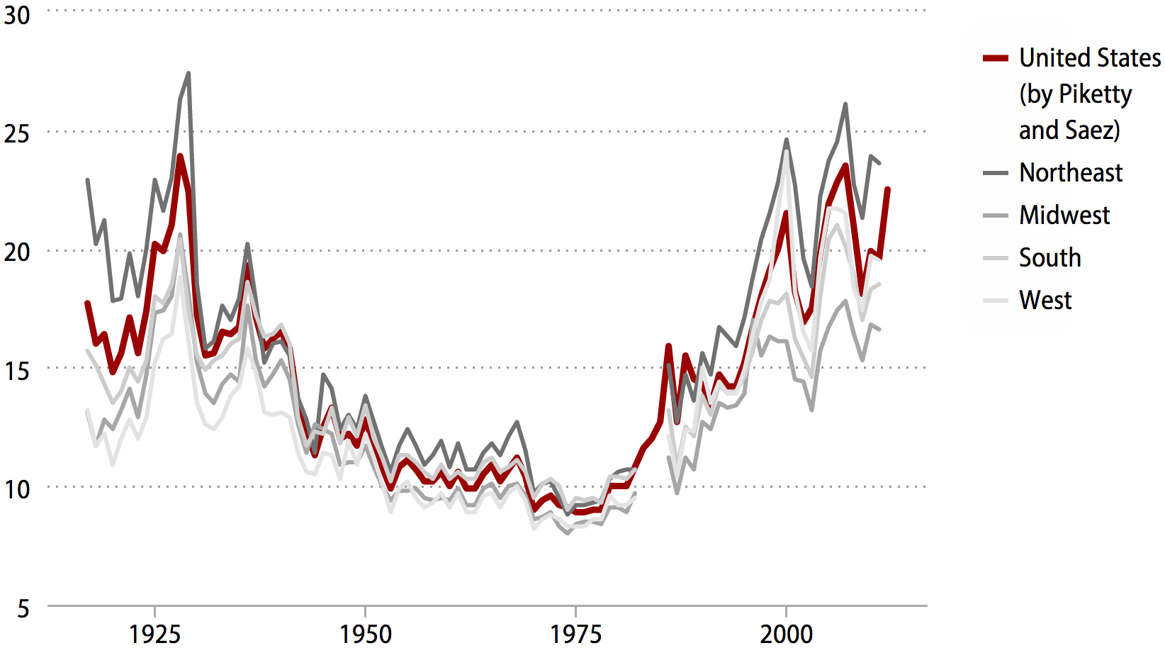
Note: Data are for tax units. Tax data from 1983 to 1985 were unavailable, hence the gap in regional figures. Income includes capital gains income.
Source: Authors' analysis of state-level tax data from Sommeiller (2006) extended to 2011 using state-level data from the Internal Revenue Service SOI Tax Stats (various years), and Piketty and Saez (2012)
The patterns of income growth over time in individual states reflect in broad terms the national pattern. Table 2 presents three snapshots of the income share of the top 1 percent in each state and the District of Columbia: in 1928, 1979, and 2007. We chose 2007 rather than 2011 because it is the recent peak in the share of income flowing to the top 1 percent. (In the next section, we will explore more recent trends in the growth in incomes.) Table 2 shows that:
- Between 1928 and 1979, in 49 states plus the District of Columbia, the share of income held by the top 1 percent declined, following the national pattern.4
- From 1979 to 2007 the share of income held by the top 1 percent increased in every state and the District of Columbia.
Top 1% share of all income, U.S. and by state and region, 1928, 1979, 2007
| Change in income share of the top 1% (percentage points) | ||||||
|---|---|---|---|---|---|---|
| Rank (by change in share 1979–2007) | State/region | 1928 | 1979 | 2007 | 1928–1979 | 1979–2007 |
| 1 | Wyoming | 12.2% | 9.1% | 31.4% | -3.1 | 22.3 |
| 2 | Connecticut | 23.6% | 11.2% | 33.4% | -12.5 | 22.2 |
| 3 | New York | 29.4% | 11.5% | 32.6% | -17.9 | 21.1 |
| 4 | Nevada | 17.8% | 11.5% | 28.0% | -6.3 | 16.5 |
| 5 | Florida | 22.2% | 12.2% | 28.1% | -10.0 | 15.9 |
| 6 | Massachusetts | 24.2% | 9.7% | 24.8% | -14.5 | 15.1 |
| 7 | Illinois | 22.5% | 9.6% | 22.8% | -12.9 | 13.2 |
| 8 | California | 20.0% | 10.2% | 22.7% | -9.7 | 12.5 |
| 9 | Washington | 14.9% | 8.3% | 20.4% | -6.6 | 12.1 |
| 10 | New Jersey | 22.9% | 9.5% | 21.4% | -13.4 | 11.8 |
| 11 | Utah | 16.0% | 7.8% | 18.8% | -8.2 | 11.0 |
| 12 | Arizona | 17.5% | 9.1% | 20.0% | -8.4 | 10.9 |
| 13 | Colorado | 19.3% | 9.0% | 19.7% | -10.3 | 10.7 |
| 14 | Tennessee | 20.6% | 9.6% | 19.7% | -11.0 | 10.1 |
| 15 | Idaho | 10.1% | 7.6% | 17.4% | -2.5 | 9.8 |
| 16 | Pennsylvania | 22.0% | 9.3% | 18.9% | -12.8 | 9.6 |
| 17 | Vermont | 17.5% | 7.7% | 17.2% | -9.8 | 9.5 |
| 18 | New Hampshire | 18.9% | 8.8% | 18.0% | -10.1 | 9.3 |
| 19 | South Carolina | 14.9% | 8.4% | 17.6% | -6.5 | 9.2 |
| 20 | Georgia | 20.3% | 9.5% | 18.7% | -10.8 | 9.2 |
| 21 | Texas | 18.7% | 11.9% | 21.0% | -6.8 | 9.1 |
| 22 | South Dakota | 12.6% | 7.7% | 16.9% | -4.9 | 9.1 |
| 23 | Oklahoma | 19.6% | 10.6% | 19.7% | -9.1 | 9.1 |
| 24 | Alabama | 17.6% | 9.5% | 18.5% | -8.0 | 8.9 |
| 25 | Oregon | 15.1% | 8.7% | 17.3% | -6.5 | 8.7 |
| 26 | Montana | 15.6% | 8.4% | 16.9% | -7.2 | 8.5 |
| 27 | Maryland | 26.4% | 8.5% | 17.0% | -17.9 | 8.5 |
| 28 | Minnesota | 19.7% | 9.3% | 17.8% | -10.4 | 8.5 |
| 29 | North Carolina | 16.7% | 9.1% | 17.0% | -7.7 | 8.0 |
| 30 | Missouri | 21.4% | 9.6% | 17.6% | -11.8 | 7.9 |
| 31 | Wisconsin | 16.8% | 8.3% | 16.2% | -8.5 | 7.9 |
| 32 | Virginia | 18.7% | 8.0% | 15.9% | -10.7 | 7.9 |
| 33 | New Mexico | 17.1% | 8.5% | 16.4% | -8.6 | 7.9 |
| 34 | Rhode Island | 23.6% | 10.3% | 18.1% | -13.3 | 7.8 |
| 35 | Alaska | 5.2% | 5.3% | 12.8% | 0.1 | 7.6 |
| 36 | Michigan | 20.9% | 9.0% | 16.5% | -11.9 | 7.5 |
| 37 | Nebraska | 14.9% | 9.1% | 16.5% | -5.8 | 7.4 |
| 38 | Delaware | 45.0% | 10.2% | 17.3% | -34.8 | 7.1 |
| 39 | Hawaii | 21.0% | 7.5% | 14.5% | -13.5 | 7.0 |
| 40 | Ohio | 21.2% | 9.0% | 15.9% | -12.1 | 6.8 |
| 41 | Kansas | 15.7% | 9.8% | 16.6% | -5.9 | 6.8 |
| 42 | Indiana | 17.1% | 8.6% | 15.3% | -8.5 | 6.7 |
| 43 | North Dakota | 12.8% | 7.8% | 14.4% | -5.1 | 6.6 |
| 44 | Kentucky | 19.4% | 9.2% | 15.8% | -10.1 | 6.6 |
| 45 | Maine | 20.5% | 8.1% | 14.5% | -12.4 | 6.4 |
| 46 | Arkansas | 14.0% | 9.8% | 16.1% | -4.2 | 6.3 |
| 47 | Iowa | 16.0% | 8.3% | 13.4% | -7.7 | 5.1 |
| 48 | West Virginia | 16.5% | 9.2% | 14.3% | -7.2 | 5.0 |
| 49 | Mississippi | 13.7% | 10.1% | 14.9% | -3.5 | 4.7 |
| 50 | Louisiana | 18.3% | 10.7% | 14.6% | -7.6 | 3.9 |
| 14* | District of Columbia | 24.1% | 12.8% | 23.1% | -11.3 | 10.3 |
| United States | 23.4% | 9.9% | 21.8% | -13.4 | 11.8 | |
| Northeast | 26.3% | 10.3% | 26.1% | -16.0 | 15.8 | |
| West | 18.8% | 9.6% | 21.5% | -9.2 | 11.9 | |
| South | 20.4% | 10.4% | 20.1% | -10.0 | 9.8 | |
| Midwest | 20.6% | 9.1% | 17.8% | -11.5 | 8.7 | |
* Rank of the District of Columbia if it were ranked with the 50 states
Note: Data are for tax units.
Source: Authors' analysis of state-level tax data from Sommeiller (2006) extended to 2007 using state-level data from the Internal Revenue Service SOI Tax Stats (various years), and Piketty and Saez (2012)
The 10 states with the biggest jumps (at least 11.8 percentage points) in the top 1 percent share from 1979 to 2007 include four states with large financial services sectors (New York, Connecticut, New Jersey, and Illinois), three with large information technology sectors (Massachusetts, California, and Washington), one state with a large energy industry (Wyoming), one with a large gaming industry (Nevada), and Florida, a state in which many wealthy individuals retire. In 18 of the other 40 states, the increase in the top 1 percent share is between 8.5 and 11.0 percentage points. In the remaining 22 states, the increase ranges between 3.9 and 8.0 percentage points.
The unequal growth of incomes resumed in the economic recovery
In the first two years of economic recovery (2009 to 2011) following the end of the Great Recession, the average income of the bottom 99 percent in the United States actually fell (by 0.7 percent). In contrast, the average income of the top 1 percent climbed 11.5 percent. In sum, only the top 1 percent gained as the economy recovered.5
As illustrated in Table 3, among the individual states between 2009 and 2011, we find:
- In 33 states the top 1 percent captured between half and all income growth.
- In 17 states the incomes of the top 1 percent grew and the incomes of the bottom 99 percent fell, but top 1 percent incomes rose enough to generate an overall increase in average incomes (in other words, for 100 percent of taxpayers). Thus, in these states the top 1 percent captured more than 100 percent of the overall increase in income. These 17 states are Colorado, Illinois, Florida, Arizona, Oregon, Arkansas, Maryland, Massachusetts, New Jersey, California, Connecticut, Tennessee, New York, Ohio, Georgia, Vermont, and Pennsylvania.
- In nine states, top 1 percent incomes grew and bottom 99 percent incomes fell, but overall average incomes (in other words, for 100 percent of taxpayers) fell. These states are Nevada, South Carolina, Alabama, Idaho, North Carolina, Missouri, Washington, Rhode Island, and Virginia. (In these states, the top 1 percent share of the overall increase in income is not a meaningful number, since the overall change in income was a negative number.)
- The remaining seven states in which the top 1 percent captured half or more of income growth include Kansas (where 91.2 percent of all income growth was captured by the top 1 percent), Michigan (91.0 percent), New Hampshire (83.3 percent), Indiana (75.6 percent), Texas (74.4 percent), Wisconsin (70.5 percent), and Maine (60.0 percent).
- In nine states, both top 1 percent and bottom 99 percent incomes rose, and the top 1 percent captured between zero and half of all income growth. Those states are Kentucky (where 48.7 percent of all income growth was captured by the top 1 percent), Wyoming (40.5 percent), North Dakota (38.9 percent), Minnesota (37.6 percent), Oklahoma (29.6 percent), Iowa (24.6 percent), Nebraska (23.3 percent), South Dakota (16.8 percent), and West Virginia (15.3 percent).
- In five states (New Mexico, Montana, Hawaii, Louisiana, and Alaska), the incomes of the top 1 percent declined as the average income of the bottom 99 percent grew.
- In Delaware, Utah, and Mississippi, the incomes of both the top 1 percent and the bottom 99 percent declined.
Income growth from 2009 to 2011, overall and for the top 1% and bottom 99%, U.S. and by state and region
| Average real income growth | |||||
|---|---|---|---|---|---|
| Rank (by top 1% income growth) | State/region | Overall | Top 1% | Bottom 99% | Share of total growth (or loss) captured by top 1% |
| 1 | North Dakota | 14.4% | 41.3% | 10.2% | 38.9% |
| 2 | Massachusetts | 2.5% | 26.5% | -3.1% | 200.8% |
| 3 | Colorado | 0.2% | 23.5% | -4.0% | 1,779.1% |
| 4 | Texas | 5.2% | 21.1% | 1.6% | 74.4% |
| 5 | Rhode Island | -1.2% | 17.3% | -4.3% | Ŧ |
| 6 | California | 2.0% | 16.9% | -1.4% | 154.9% |
| 7 | Ohio | 1.6% | 14.8% | -0.4% | 123.4% |
| 8 | Oklahoma | 7.7% | 13.8% | 6.5% | 29.6% |
| 9 | Virginia | -0.4% | 13.8% | -2.7% | Ŧ |
| 10 | New Hampshire | 2.5% | 13.7% | 0.5% | 83.3% |
| 11 | Wyoming | 6.9% | 13.6% | 5.2% | 40.5% |
| 12 | Kansas | 2.1% | 13.3% | 0.2% | 91.2% |
| 13 | Washington | -1.0% | 13.1% | -3.5% | Ŧ |
| 14 | Michigan | 2.1% | 12.8% | 0.2% | 91.0% |
| 15 | Minnesota | 5.1% | 12.5% | 3.8% | 37.6% |
| 16 | Connecticut | 2.1% | 11.8% | -1.5% | 153.0% |
| 17 | Maryland | 0.5% | 11.1% | -1.2% | 324.7% |
| 18 | New York | 2.1% | 10.7% | -1.0% | 135.8% |
| 19 | Missouri | -1.7% | 10.2% | -3.8% | Ŧ |
| 20 | Iowa | 4.5% | 9.6% | 3.8% | 24.6% |
| 21 | Nebraska | 5.3% | 9.5% | 4.7% | 23.3% |
| 22 | New Jersey | 1.0% | 9.4% | -0.9% | 178.0% |
| 23 | Florida | 0.2% | 9.2% | -2.4% | 906.6% |
| 24 | South Dakota | 8.5% | 9.0% | 8.4% | 16.8% |
| 25 | Illinois | 0.1% | 8.8% | -1.9% | 1,766.1% |
| 26 | Vermont | 1.0% | 8.6% | -0.2% | 116.4% |
| 27 | Pennsylvania | 1.3% | 8.3% | -0.05% | 103.0% |
| 28 | Indiana | 1.5% | 8.1% | 0.4% | 75.6% |
| 29 | Oregon | 0.2% | 7.4% | -1.0% | 680.6% |
| 30 | Tennessee | 0.7% | 6.3% | -0.4% | 144.2% |
| 31 | Georgia | 0.8% | 6.2% | -0.2% | 117.1% |
| 32 | North Carolina | -1.6% | 6.2% | -2.9% | Ŧ |
| 33 | Arizona | 0.1% | 5.9% | -1.0% | 686.0% |
| 34 | Kentucky | 1.2% | 4.4% | 0.7% | 48.7% |
| 35 | Alabama | -1.8% | 4.3% | -2.9% | Ŧ |
| 36 | Maine | 0.9% | 4.2% | 0.4% | 60.0% |
| 37 | Nevada | -4.4% | 4.0% | -6.7% | Ŧ |
| 38 | Wisconsin | 0.9% | 3.9% | 0.3% | 70.5% |
| 39 | West Virginia | 3.7% | 3.7% | 3.7% | 15.3% |
| 40 | Idaho | -1.1% | 3.4% | -1.8% | Ŧ |
| 41 | South Carolina | -1.3% | 3.3% | -2.1% | Ŧ |
| 42 | Arkansas | 0.1% | 2.9% | -0.5% | 534.7% |
| 43 | Delaware | -2.7% | -0.5% | -3.1% | 2.8% |
| 44 | Alaska | 1.0% | -1.2% | 1.3% | ¥ |
| 45 | Utah | -0.6% | -1.2% | -0.4% | 32.8% |
| 46 | New Mexico | 1.5% | -3.1% | 2.3% | ¥ |
| 47 | Mississippi | -1.1% | -4.8% | -0.5% | 62.4% |
| 48 | Montana | 2.3% | -6.9% | 4.1% | ¥ |
| 49 | Louisiana | 0.1% | -7.7% | 1.5% | ¥ |
| 50 | Hawaii | 2.7% | -12.3% | 4.9% | ¥ |
| 46* | District of Columbia | 3.9% | -1.3% | 5.2% | ¥ |
| United States | 1.5% | 11.5% | -0.7% | 140.9% | |
| West | 1.1% | 13.4% | -1.5% | 215.5% | |
| Northeast | 1.7% | 12.7% | -1.3% | 161.8% | |
| South | 1.5% | 10.4% | -0.4% | 121.2% | |
| Midwest | 1.8% | 10.6% | 0.2% | 90.3% | |
* Rank of the District of Columbia if it were ranked with the 50 states
Ŧ Only the incomes of the top 1% grew over this period.
¥ Only the incomes of the top 1% fell over this period.
Note: Data are for tax units.
Source: Authors' analysis of state-level tax data from Sommeiller (2006) extended to 2011 using state-level data from the Internal Revenue Service SOI Tax Stats (various years), and Piketty and Saez (2012)
Income inequality across the states in 2011
Table 4 presents data by state for 2011 on the average income of the top 1 percent of taxpayers, the average income of the bottom 99 percent, and the ratio of these values. According to estimates by University of California at Berkeley economist Emmanuel Saez, in the United States as a whole, on average the top 1 percent of taxpayers earned 24 times as much income as the bottom 99 percent in 2011. His latest estimates, released in August 2013, put that ratio in 2012 at 28.7-to-1 (Piketty and Saez 2012).6
Ratio of top 1% income to bottom 99% income, U.S. and by state and region, 2011
| Rank (by top-to-bottom ratio) | State/region | Average income of the top 1% | Average income of the bottom 99% | Top-to-bottom ratio |
|---|---|---|---|---|
| 1 | Connecticut | $2,178,817 | $53,694 | 40.6 |
| 2 | New York | $1,749,590 | $43,202 | 40.5 |
| 3 | Florida | $1,141,314 | $35,393 | 32.2 |
| 4 | Massachusetts | $1,535,356 | $50,843 | 30.2 |
| 5 | Nevada | $1,091,021 | $36,975 | 29.5 |
| 6 | Wyoming | $1,473,766 | $53,403 | 27.6 |
| 7 | California | $1,223,617 | $45,589 | 26.8 |
| 8 | Texas | $1,185,033 | $45,130 | 26.3 |
| 9 | Illinois | $1,083,216 | $44,210 | 24.5 |
| 10 | New Jersey | $1,312,077 | $54,864 | 23.9 |
| 11 | Colorado | $1,098,682 | $47,837 | 23.0 |
| 12 | Arkansas | $698,681 | $32,932 | 21.2 |
| 13 | Washington | $972,325 | $46,541 | 20.9 |
| 14 | Oklahoma | $883,082 | $42,334 | 20.9 |
| 15 | Pennsylvania | $882,574 | $43,399 | 20.3 |
| 16 | Rhode Island | $851,183 | $41,958 | 20.3 |
| 17 | Arizona | $713,324 | $35,393 | 20.2 |
| 18 | New Hampshire | $1,010,409 | $50,311 | 20.1 |
| 19 | North Dakota | $1,064,581 | $53,372 | 19.9 |
| 20 | Tennessee | $734,288 | $37,016 | 19.8 |
| 21 | Georgia | $770,823 | $39,094 | 19.7 |
| 22 | Michigan | $707,446 | $35,988 | 19.7 |
| 23 | Missouri | $760,105 | $38,779 | 19.6 |
| 24 | Minnesota | $947,312 | $48,682 | 19.5 |
| 25 | Alabama | $665,177 | $34,874 | 19.1 |
| 26 | Kansas | $883,359 | $46,416 | 19.0 |
| 27 | South Dakota | $935,048 | $49,711 | 18.8 |
| 28 | Wisconsin | $783,236 | $42,465 | 18.4 |
| 29 | Ohio | $699,693 | $38,583 | 18.1 |
| 30 | Virginia | $981,383 | $54,667 | 18.0 |
| 31 | North Carolina | $702,503 | $39,145 | 17.9 |
| 32 | Montana | $672,899 | $37,740 | 17.8 |
| 33 | Utah | $762,317 | $42,976 | 17.7 |
| 34 | West Virginia | $560,682 | $31,626 | 17.7 |
| 35 | Oregon | $663,156 | $37,774 | 17.6 |
| 36 | Louisiana | $705,301 | $41,112 | 17.2 |
| 37 | South Carolina | $590,036 | $34,402 | 17.2 |
| 38 | Maryland | $1,007,595 | $59,011 | 17.1 |
| 39 | Vermont | $705,381 | $41,737 | 16.9 |
| 40 | Indiana | $650,347 | $38,941 | 16.7 |
| 41 | Kentucky | $578,193 | $34,716 | 16.7 |
| 42 | Idaho | $641,757 | $39,288 | 16.3 |
| 43 | Delaware | $732,052 | $45,059 | 16.2 |
| 44 | New Mexico | $557,849 | $35,649 | 15.6 |
| 45 | Nebraska | $803,826 | $51,745 | 15.5 |
| 46 | Mississippi | $503,135 | $33,112 | 15.2 |
| 47 | Maine | $573,933 | $38,486 | 14.9 |
| 48 | Iowa | $659,386 | $48,249 | 13.7 |
| 49 | Alaska | $790,816 | $58,482 | 13.5 |
| 50 | Hawaii | $635,052 | $52,294 | 12.1 |
| 11* | District of Columbia | $1,467,468 | $63,282 | 23.2 |
| United States | $1,040,506 | $42,694 | 24.4 | |
| Northeast | $1,425,607 | $46,501 | 30.7 | |
| Midwest | $823,063 | $41,799 | 19.7 | |
| South | $921,361 | $41,075 | 22.4 | |
| West | $1,047,813 | $43,787 | 23.9 |
* Rank of the District of Columbia if it were ranked with the 50 states
Note: Data are for tax units.
Source: Authors' analysis of state-level tax data from Sommeiller (2006) extended to 2011 using state-level data from the Internal Revenue Service SOI Tax Stats (various years), and Piketty and Saez (2012)
According to state-level data, available only through 2011, the largest gaps between the top 1 percent and the bottom 99 percent are in Connecticut and New York. In both states the top 1 percent in 2011 earned on average over 40 times the income of the bottom 99 percent of taxpayers. This reflects in part the relative concentration of the financial sector in the greater New York City metropolitan area.
After New York and Connecticut, the next eight states with the largest gaps between the top 1 percent and bottom 99 percent in 2011 are Florida (where the top 1 percent earned 32.2 times as much as the bottom 99 percent, on average), Massachusetts (30.2), Nevada (29.5), Wyoming (27.6), California (26.8), Texas (26.3), Illinois (24.5), and New Jersey (23.9).
Even in the 10 states with the smallest gaps between the top 1 percent and bottom 99 percent in 2011, the top 1 percent earned between about 12 and 17 times the income of the bottom 99 percent. Those states include Kentucky (where the top 1 percent earned 16.7 times as much as the bottom 99 percent, on average), Idaho (16.3), Delaware (16.2), New Mexico (15.6), Nebraska (15.5), Mississippi (15.2), Maine (14.9), Iowa (13.7), Alaska (13.5), and Hawaii (12.1).
Reported in Table 5 are the threshold incomes required to be considered part of the top 1 percent by state. Table 5 also includes the threshold to be included in the 1 percent of the 1 percent (or the top 0.01 percent). Finally, the average income of the top 0.01 percent (the highest one out of 10,000 taxpayers) is ranked among the 50 states.
Connecticut had the highest average income in 2011 for the top 0.01 percent, $57.2 million. Wyoming’s top 0.01 percent had an average income of $50.1 million, and New York’s, in third place, had an average income of $49.7 million.
The lowest average incomes of the top 0.01 percent were $6.4 million in Mississippi, $7.8 million in South Carolina, and $7.9 million in Maine.
Income threshold of top 1% and top .01%, and average income of top .01%, U.S. and by state and region, 2011
| Rank (by average income of top .01%) | State/region | Income threshold of top 1% | Income threshold of top .01% | Average income of top .01% |
|---|---|---|---|---|
| 1 | Connecticut | $624,524 | $16,630,571 | $57,158,181 |
| 2 | Wyoming | $347,420 | $11,688,244 | $50,123,531 |
| 3 | New York | $465,706 | $13,645,115 | $49,737,418 |
| 4 | Massachusetts | $483,642 | $11,483,247 | $38,285,255 |
| 5 | Nevada | $291,973 | $8,531,471 | $31,729,887 |
| 6 | Florida | $336,935 | $8,659,187 | $29,654,038 |
| 7 | California | $392,895 | $9,033,459 | $29,323,990 |
| 8 | Texas | $378,527 | $8,752,645 | $28,513,668 |
| 9 | Colorado | $356,256 | $8,092,735 | $27,213,547 |
| 10 | New Hampshire | $321,739 | $7,464,862 | $26,317,489 |
| 11 | New Jersey | $499,710 | $8,712,835 | $23,184,574 |
| 12 | Illinois | $379,353 | $7,607,326 | $22,083,645 |
| 13 | Washington | $332,464 | $6,965,798 | $22,054,730 |
| 14 | Rhode Island | $287,311 | $6,081,817 | $19,923,786 |
| 15 | North Dakota | $399,581 | $7,166,216 | $19,574,464 |
| 16 | Kansas | $312,224 | $6,190,574 | $19,460,810 |
| 17 | South Dakota | $327,833 | $6,528,041 | $19,386,078 |
| 18 | Arkansas | $268,521 | $4,885,067 | $18,642,310 |
| 19 | Virginia | $373,550 | $6,606,041 | $18,554,215 |
| 20 | Maryland | $388,112 | $6,682,288 | $17,973,401 |
| 21 | Oklahoma | $312,784 | $6,141,210 | $17,654,483 |
| 22 | Minnesota | $368,646 | $6,267,273 | $17,244,271 |
| 23 | Pennsylvania | $329,763 | $5,989,165 | $17,222,900 |
| 24 | Wisconsin | $283,074 | $5,387,667 | $16,023,678 |
| 25 | Nebraska | $302,007 | $5,420,842 | $15,460,603 |
| 26 | Missouri | $276,958 | $5,192,083 | $15,275,495 |
| 27 | Vermont | $256,807 | $4,813,236 | $15,035,529 |
| 28 | Alabama | $239,487 | $4,548,323 | $14,084,100 |
| 29 | Utah | $290,874 | $5,055,146 | $13,722,051 |
| 30 | Tennessee | $280,999 | $4,872,952 | $13,398,304 |
| 31 | Arizona | $267,667 | $4,782,804 | $13,393,254 |
| 32 | Michigan | $271,286 | $4,681,701 | $13,130,284 |
| 33 | Georgia | $306,724 | $4,963,553 | $13,012,539 |
| 34 | Montana | $262,719 | $4,358,105 | $12,588,246 |
| 35 | Ohio | $280,044 | $4,482,475 | $11,984,269 |
| 36 | Idaho | $246,325 | $4,217,156 | $11,513,067 |
| 37 | North Carolina | $288,928 | $4,415,411 | $11,453,380 |
| 38 | Oregon | $271,754 | $4,177,988 | $11,291,789 |
| 39 | West Virginia | $237,787 | $3,608,715 | $10,739,297 |
| 40 | Louisiana | $288,552 | $4,367,491 | $10,562,618 |
| 41 | Indiana | $264,827 | $4,076,432 | $10,468,954 |
| 42 | Delaware | $311,284 | $4,357,359 | $9,876,547 |
| 43 | Hawaii | $267,162 | $3,897,088 | $9,866,632 |
| 44 | Iowa | $284,498 | $3,966,942 | $9,761,329 |
| 45 | Alaska | $352,714 | $4,428,775 | $9,524,204 |
| 46 | Kentucky | $261,940 | $3,482,335 | $8,815,881 |
| 47 | New Mexico | $263,041 | $3,451,349 | $8,769,430 |
| 48 | Maine | $254,321 | $3,356,202 | $7,926,538 |
| 49 | South Carolina | $259,922 | $3,429,734 | $7,829,553 |
| 50 | Mississippi | $234,876 | $2,847,842 | $6,448,737 |
| 9* | District of Columbia | $509,461 | $10,062,401 | $27,694,421 |
| United States | $348,498 | $7,508,585 | $23,381,212 | |
| Northeast | $438,490 | $10,685,484 | $35,383,569 | |
| West | $345,919 | $7,626,450 | $24,352,437 | |
| South | $319,022 | $6,522,978 | $19,748,917 | |
| Midwest | $307,833 | $5,554,099 | $15,691,377 |
* Rank of the District of Columbia if it were ranked with the 50 states.
Note: Data are for tax units.
Source: Authors' analysis of state-level tax data from Sommeiller (2006) extended to 2011 using state-level data from the Internal Revenue Service SOI Tax Stats (various years), and Piketty and Saez (2012)
Conclusion
The rise in inequality experienced in the United States in the past three-and-a-half decades is not just a story of those in the financial sector in the greater New York City metropolitan area reaping outsized rewards from speculation in financial markets. While many of the highest-income taxpayers do live in states like New York and Connecticut, IRS data make clear that rising inequality and increases in top 1 percent incomes affect every state. Between 1979 and 2007, the top 1 percent of taxpayers in all states captured an increasing share of income. And from 2009 to 2011, in the wake of the Great Recession, top 1 percent incomes in most states once again grew faster than the incomes of the bottom 99 percent.
The rise between 1979 and 2007 in top 1 percent incomes relative to the bottom 99 percent represents a sharp reversal of the trend that prevailed in the mid-20th century. Between 1928 and 1979, the share of income held by the top 1 percent declined in every state except Alaska (where the top 1 percent held a relatively low share of income throughout the period). This earlier era was characterized by a rising minimum wage, low levels of unemployment after the 1930s, widespread collective bargaining in private industries (manufacturing, transportation [trucking, airlines, and railroads], telecommunications, and construction), and a cultural and political environment in which it was unthinkable for executives to receive outsized bonuses while laying off workers.
Today, unionization and collective bargaining levels are at historic lows not seen since before 1928 (Freeman 1997). The federal minimum wage purchases fewer goods and services than it did in 1968 (Cooper 2013). And executives in companies from Hostess (Castellano 2012) to American International Group (AIG) think nothing of demanding bonuses after bankrupting their companies and receiving multibillion-dollar taxpayer bailouts (Andrews and Baker 2009).
Policy choices and cultural forces have combined to put downward pressure on the wages and incomes of most Americans even as their productivity has risen. CEOs and financial-sector executives at the commanding heights of the private economy have raked in a rising share of the nation’s expanding economic pie, setting new norms for top incomes often emulated today by college presidents (as well as college football and basketball coaches), surgeons, lawyers, entertainers, and professional athletes.
The yawning economic gaps in today’s “1 percent economy” have myriad economic and societal consequences. For example, growing inequality blocks living standards growth for the middle class. The Economic Policy Institute’s The State of Working America, 12th Edition found that between 1979 and 2007, had the income of the middle fifth of households grown at the same rate as overall average household income, it would have been $18,897 higher in 2007—27.0 percent higher than it actually was. In other words, rising inequality imposed a tax of 27.0 percent on middle-fifth household incomes over this period (Mishel et al. 2012). Thompson and Leight (2012) find that rising top 1 percent shares within individual states are associated with declines in earnings among middle-income families.
Additionally, increased inequality may eventually reduce intergenerational income mobility. More than in most other advanced countries, in America the children of affluent parents grow up to be affluent, and the children of the poor remain poor (Corak 2012). Today’s levels of inequality in the United States raise a new American Dilemma (Myrdal 1944): Can rising inequality be tolerated in a country that values so dearly the ideal that all people should have opportunity to succeed, regardless of the circumstances of their birth?
In the next decade, something must give. Either America must accept that the American Dream of widespread economic mobility is dead, or new policies must emerge that will begin to restore broadly shared prosperity.
Since the “1 percent economy” is evident in every state, every state—and every metro area and region—has an opportunity to demonstrate to the nation new and more equitable policies. We hope these data on income inequality by state will spur more states, regions, and cities to enact the bold policies our nation needs to become, once again, a land of opportunity.
About the authors
Estelle Sommeiller, a socio-economist at the Institute for Research in Economic and Social Sciences in France, holds two Ph.D.s in economics, from the University of Delaware as well as from the Université Lumière in Lyon, France. Thomas Piketty and Emmanuel Saez both approved her doctoral dissertation, Regional Inequality in the United States, 1913-2003, which was awarded the highest distinction by her dissertation committee. This report is based on, and updates, her dissertation.
The Institute for Research in Economic and Social Sciences (IRES) in France is the independent research center of the six labor unions being officially granted representation nationwide. Created in 1982 with the government’s financial support, IRES is registered as a private non-profit organization under the Associations Act of 1901. IRES’s mission is to analyze the economic and social issues, at the national, European, and international levels, of special interest to labor unions. More information is available at www.ires.fr.
Mark Price, a labor economist at the Keystone Research Center, holds a Ph.D. in economics from the University of Utah. His dissertation, State Prevailing Wage Laws and Construction Labor Markets, was recognized with an honorable mention in the 2006 Thomas A. Kochan and Stephen R. Sleigh Best Dissertation Awards Competition sponsored by the Labor and Employment Relations Association.
The Keystone Research Center (KRC) was founded in 1996 to broaden public discussion on strategies to achieve a more prosperous and equitable Pennsylvania economy. Since its creation, KRC has become a leading source of independent analysis of Pennsylvania’s economy and public policy. The Keystone Research Center is located at 412 North Third Street, Harrisburg, Pennsylvania 17101-1346. Most of KRC’s original research is available from the KRC website at www.keystoneresearch.org.
Acknowledgments
The authors thank the staff at the Internal Revenue Service for their public service and assistance in collecting state-level tax data, as well as the staff at the University of Delaware library for their assistance in obtaining IRS documentation. The authors also wish to thank Emmanuel Saez for graciously providing details on the construction of the Piketty and Saez top-income time series and for providing guidance on adjustments to make when constructing a state-by-state time series. This work would also have not been possible without Thomas Piketty’s (2001) own careful work and notes on how he constructed his top-income time series. Thanks also to Stephen Herzenberg at the Keystone Research Center; Frédéric Lerais at the Institute for Research in Economic and Social Sciences; Lawrence Mishel, Doug Hall, David Cooper, Lora Engdahl, Michael McCarthy, Elizabeth Rose, Dan Essrow, and Donté Donald at the Economic Policy Institute; and Colin Gordon at the Iowa Center for Public Policy for their helpful comments and support in the preparation of this report.
Methodological appendix
The most common sources of data on wages and incomes by state are derived from surveys of households such as the Current Population Survey and the American Community Survey. These data sources are not well-suited to tracking trends in income by state among the highest-income households, especially the top 1 percent. Trends in top incomes can be estimated from data published by the IRS on the amount of income and number of taxpayers in different income ranges (Internal Revenue Service SOI Tax Stats various years). Table A1 presents this data for Pennsylvania in 2011.
Individual income and tax data for Pennsylvania, by size of adjusted gross income, tax year 2011
| Number of returns | Adjusted gross income (thousands) | Share of aggregate adjusted gross income | |
|---|---|---|---|
| All returns | 6,183,225 | $348,612,836 | 100% |
| Under $1 | 82,325 | -$4,608,529 | −1% |
| $1 – < $25,000 | 2,419,804 | $28,102,112 | 8% |
| $25,000 – < $50,000 | 1,458,749 | $52,856,101 | 15% |
| $50,000 – < $75,000 | 859,952 | $52,954,678 | 15% |
| $75,000 – < $100,000 | 543,875 | $47,004,707 | 13% |
| $100,000 – < $200,000 | 633,858 | $84,200,638 | 24% |
| $200,000 – < $500,000 | 151,006 | $43,064,934 | 12% |
| $500,000 – < $1,000,000 | 23,476 | $15,763,810 | 5% |
| $1,000,000 or more | 10,180 | $29,274,384 | 8% |
Source: Authors' analysis of state-level tax data from Sommeiller (2006) extended to 2011 using state-level data from the Internal Revenue Service SOI Tax Stats (various years), and Piketty and Saez (2012)
Knowing the amount of income and the number of taxpayers in each bracket, we can use the properties of a statistical distribution known as the Pareto distribution to extract estimates of incomes at specific points in the distribution of income, including the 90th, 95th, and 99th percentiles.7 With these threshold values we then calculate the average income of taxpayers with incomes that lie between these ranges, such as the average income of taxpayers with incomes greater than the 99th percentile (i.e., the average income of the top 1 percent).
Calculating income earned by each group of taxpayers as well as the share of all income they earn requires state-level estimates in each year between 1917 and 2011 of the universe of potential taxpayers (hereafter called tax units) and the total amount of income earned in each state. Piketty and Saez (2012) have national estimates of tax units8 and total income (including capital gains), which we allocate to the states.9
In the sections that follow we describe in more detail the assumptions we made in generating our top income estimates by state. We will then review errors we observe in our interpolation of top incomes from 1917 to 2011 and compare our interpolation results to top income estimates obtained from the Pennsylvania Department of Revenue. Next we will briefly illustrate the calculations we used to interpolate the 90th, 95th, and 99th percentiles from the data presented in Table A1. Finally, the last section of the appendix will present our top income estimates for the United States as a whole, alongside the same estimates from Piketty and Saez (2012).
Estimating tax units by state
In order to allocate Piketty and Saez’s national estimate of tax units to the states, we estimate each state’s share of the sum of married men, divorced and widowed men and women, and single men and women 20 years of age or over. From 1979 to 2011, tax unit series at the state level are estimated using data from the Current Population Survey (basic monthly microdata). From 1917 to 1978, the state total of tax units had to be proxied by the number of household units released by the Census Bureau, the only source of data available over this time period.10 For inter-decennial years, the number of household units is estimated by linear interpolation.
Estimating total income (including capital gains)
We allocate Piketty and Saez’s total income to the states using personal income data from the Bureau of Economic Analysis (BEA). From 1929 to 2011 we calculate each state’s share of personal income after subtracting out personal current transfer receipts.11 These shares are then multiplied by Piketty and Saez’s national estimate of total income (including capital gains) to estimate total income by state over the period. Because BEA personal income data are not available prior to 1929, we inflate total income derived from the tax tables for each state in each year from 1917 to 1928 by the average of the ratio of total taxable income to total personal income (minus transfers) from the BEA from 1929 to 1939. The resulting levels are summed across the states and a new share is calculated and multiplied by Piketty and Saez’s national estimate of total income (including capital gains).
Pareto interpolation
In a study of the distribution of incomes in various countries, the Italian economist Vilfredo Pareto observed that as the amount of income doubles, the number of people earning that amount falls by a constant factor. In the theoretical literature, this constant factor is usually called the Pareto coefficient (labeled bi in Table A5).12 Combining this property of the distribution of incomes with published tax data on the number of tax units and the amount of income at certain levels, it is possible to estimate the top decile (or the highest-earning top 10 percent of tax units), and within the top decile, a series of percentiles such as the average annual income earned by the highest-income 1 percent of tax units, up to and including the top 0.01 percent fractile (i.e., the average annual income earned by the richest 1 percent of the top 1 percent of tax units).13
Our data series here matches most closely what Piketty and Saez (2001) label as “variant 3,” a time series of average top incomes and income shares that includes capital gains. In generating their “variant 3” time series Piketty and Saez make two key adjustments to top average incomes. We will now describe those adjustments.
From net to gross income and the yearly problem of deductions
After an estimate of top incomes was obtained via Pareto interpolation, Piketty and Saez adjusted average incomes upward to account for net income deductions (1917 to 1943) and adjusted gross income adjustments (1944–2011).14 We followed Piketty and Saez and made the same adjustments uniformly across the states.
The IRS definition of income has varied over time. The IRS used the term “net income” until 1943, and “adjusted gross income” (AGI) from 1944 on. In the net income definition, the various deductions taken into account (donations to charity, mortgage interests paid, state and local taxes, etc.) were smaller over 1913–1943 than over 1944–2011. As a result, income estimates from 1913 to 1943 had to be adjusted upward.
To a lesser extent, incomes between 1944 and 2011 also had to be adjusted upward, as the term “adjusted” in AGI refers to various income deductions (contributions to individual retirement accounts, moving expenses, self-employment pension plans, health savings accounts, etc.). As Piketty and Saez note (2004, 33, iii), AGI adjustments are small (about 1 percent of AGI, up to 4 percent in the mid-1980s), and their importance declines with income within the top decile.
The treatment of capital gains across states, 1934–1986
The second major adjustment to incomes made by Piketty and Saez to their “variant 3” series were corrections to take into account the exclusion of a portion of capital gains from net income from 1934 to 1986.
Replicating Piketty and Saez’s capital gains adjustments uniformly across the states would, because of the concentration of income by geography, understate top incomes in high-income states like New York and overstate top incomes in low-income states like Mississippi. Unfortunately, state-level aggregates of capital gains income are not available at this time.
Instead, as a proxy we take each state’s deviation of top incomes from the U.S. average top income,15 and use this figure to adjust up or down the coefficients Piketty and Saez employ to correct for the exclusion of a portion of capital gains income from net income and AGI from 1934 to 1986.
Interpolation errors
Data users should exercise some caution in analyzing the full data series (provided online at go.epi.org/top-incomes). We have identified 19 instances where our Pareto interpolation generated an income threshold that was higher than the next-higher income threshold. For example, in Wyoming in 2010 by Pareto interpolation we estimate the 90th percentile income to be $123,834, but also by Pareto interpolation we estimate the income at the 95th percentile as $119,168. Both estimates cannot be correct. The average incomes interpolated for groups between these thresholds will also be affected by this error. Table A2 presents the percentiles affected in each state by this error as well as the year in which the error occurred. Data users making comparisons over time should examine the entire time series for a state before drawing conclusions about time trends from a single point-to-point comparison.
States and percentiles affected by errors in Pareto interpolations used to generate income thresholds, 1917–2011
| States | P90>P95 | P95>P99 | P99>P99.5 | P99.5>P99.9 | P99.9>P99.99 | Total number of errors |
|---|---|---|---|---|---|---|
| Alaska | 1948, 1949, 1950, 1955, 1982 | 1918, 1919, 1920, 1921, 1922, 1923 | 1932, 1933 | 13 | ||
| Idaho | 1960 | 1 | ||||
| New Mexico | 1965 | 1 | ||||
| West Virginia | 1951, 1952 | 2 | ||||
| Wyoming | 2010 | 1 |
Source: Authors' analysis of state-level tax data from Sommeiller (2006) extended to 2011 using state-level data from the Internal Revenue Service SOI Tax Stats (various years), and Piketty and Saez (2012)
Even when our estimates of each threshold are lower than the next-higher threshold (in other words, the 90th percentile is lower than the 95th percentile, and so on), errors can still arise in our calculation of the average incomes that lie between those percentiles. For example, in 2011 we estimate the average income between the 90th and 95th percentiles in Alabama was $119,120, while estimating the 95th percentile income as $109,260. Table A3 summarizes the number of such errors in our data set, excluding those that result from the errors reported in Table A2. Most of these errors occur in the bottom half of the 10th percentile.16
Percentiles affected by errors in the estimation of interfractile average incomes, 1917–2011
| Errors | Number |
|---|---|
| P90–P95>P95 | 221 |
| P95–P99>P99 | 1 |
| P99–99.5>P99.5 | 14 |
| P99.5–99.9>P99.9 | 5 |
| P99.9–99.99>P99.99 | 3 |
Note: This table does not include errors reported in Table A2.
Source: Authors' analysis of state-level tax data from Sommeiller (2006) extended to 2011 using state-level data from the Internal Revenue Service SOI Tax Stats (various years), and Piketty and Saez (2012)
Comparing imputed top incomes to actual top incomes
The methods discussed here to estimate top incomes from the data contained in Table A1 are not as precise as actually having a database of all individual tax returns from which to calculate average incomes for the highest-income taxpayers.The Pennsylvania Department of Revenue has generated and published more-precise top-income figures for Pennsylvania taxpayers filing their state tax returns in recent years. This allows us to compare the actual income data with the results of estimates using our standard method (the standard method being our only option for generating estimates in the other 49 states and for Pennsylvania in earlier years). It turns out that our methods underestimate the actual rise in top incomes.
Table A4 presents, using two different methods, the share of all income held by the top 1 percent as well as the average income of the top 1 percent for Pennsylvania. The first two columns present our projections based on IRS tax tables. The second two columns present the actual data on top incomes published by the Pennsylvania Department of Revenue for the years 2000 to 2011. Based on our projections using IRS data, top incomes in Pennsylvania grew by 8.3 percent between 2009 and 2011. Actually reported Pennsylvania Department of Revenue data show a rise of 9.3 percent. Between 2000 and 2011, our estimate of the share of income held by the top 1 percent was 2.6 percentage points lower than the actual figures. Likewise, from 2000 to 2011 our projection of the average income of the top 1 percent averaged 87 percent of the actual figures.
Comparing projections of top incomes in Pennsylvania with actual levels, 2000–2011
| Projections based on Internal Revenue Service data | Actual levels as reported by the Pennsylvania Department of Revenue | |||||
|---|---|---|---|---|---|---|
| Year | Income share of the top 1% | Average income of the top 1% | Income share of the top 1% | Average income of the top 1% | Percentage-point difference between actual and projected income share of top 1% | Projected average income of top 1% as share of actual |
| 2000 | 17.5% | $988,702 | 19.6% | $1,112,708 | 2.1 | 89% |
| 2001 | 15.5% | $823,838 | 16.9% | $901,064 | 1.4 | 91% |
| 2002 | 14.7% | $751,226 | 16.6% | $847,263 | 1.9 | 89% |
| 2003 | 15.3% | $795,846 | 17.6% | $916,052 | 2.3 | 87% |
| 2004 | 16.0% | $876,640 | 18.9% | $1,033,381 | 2.9 | 85% |
| 2005 | 17.9% | $994,689 | 21.2% | $1,180,531 | 3.3 | 84% |
| 2006 | 18.3% | $1,042,094 | 21.8% | $1,238,940 | 3.5 | 84% |
| 2007 | 18.9% | $1,115,166 | 21.6% | $1,273,945 | 2.7 | 88% |
| 2008 | 16.9% | $918,147 | 19.9% | $1,086,298 | 3.0 | 85% |
| 2009 | 15.9% | $814,912 | 18.3% | $936,591 | 2.4 | 87% |
| 2010 | 17.4% | $905,113 | 20.1% | $1,052,402 | 2.7 | 86% |
| 2011 | 17.0% | $882,574 | 19.8% | $1,023,723 | 2.8 | 86% |
| % change, 2009–2011 | 8.3% | 9.3% | ||||
| Average, 2000–2011 | 2.6 | 87% | ||||
Note: Data are for tax units.
Source: Authors' analysis of state-level tax data from Sommeiller (2006) extended to 2011 using state level data from the Internal Revenue Service SOI Tax Stats (various years), Piketty and Saez (2012), and the Pennsylvania Department of Revenue (various years)
Calculating the 90th, 95th, and 99th percentiles for Pennsylvania
Listed in Table A5 are the calculations we use to interpolate the 90th, 95th, and 99th percentile incomes for Pennsylvania.17 For brevity we present only the equations for calculating the average incomes by fractiles in Table A6.
An example of Pareto interpolation for Pennsylvania in 2011
| Row # | Income brackets | Lower bound (si) | Number of returns (Ni) | Cumulative # of returns (Ni*) | Adjusted gross income (Yi) | Cumulative adjusted gross income (Yi*) |
|---|---|---|---|---|---|---|
| 1 | No income | <= 0 | 82,325 | 6,183,225 | -4,608,529 | 348,612,835 |
| 2 | 1–<25,000 | 1 | 2,419,804 | 6,100,900 | 28,102,112 | 353,221,364 |
| 3 | 25,000–< 50,000 | 25,000 | 1,458,749 | 3,681,096 | 52,856,101 | 325,119,252 |
| 4 | 50,000–< 75,000 | 50,000 | 859,952 | 2,222,347 | 52,954,678 | 272,263,151 |
| 5 | 75,000–< 100,000 | 75,000 | 543,875 | 1,362,395 | 47,004,707 | 219,308,473 |
| 6 | 100,000–< 200,000 | 100,000 | 633,858 | 818,520 | 84,200,638 | 172,303,766 |
| 7 | 200,000–< 500,000 | 200,000 | 151,006 | 184,662 | 43,064,934 | 88,103,128 |
| 8 | 500,000–<1,000,000 | 500,000 | 23,476 | 33,656 | 15,763,810 | 45,038,194 |
| 10 | 1,000,000 or more | 1,000,000 | 10,180 | 10,180 | 29,274,384 | 29,274,384 |
| 11 | Total | 6,183,225 | 348,612,836 | |||
| Row # | (yi = Yi* / Ni*) | Pareto Coefficient (bi= yi / si) | ai = (bi / (bi-1) | pi % = Ni* / N* | ki = si * [pi power(1/ai)] | |
| 1 | 56,380 | |||||
| 2 | 57,897 | 91.77 | ||||
| 3 | 88,321 | 3.53 | 1.39 | 55.37 | 16,363 | |
| 4 | 122,512 | 2.45 | 1.69 | 33.43 | 26,139 | |
| 5 | 160,973 | 2.15 | 1.87 | 20.49 | 32,166 | |
| 6 | 210,506 | 2.11 | 1.90 | 12.31 | 33,301 | |
| 7 | 477,105 | 2.39 | 1.72 | 2.78 | 24,952 | |
| 8 | 1,338,192 | 2.68 | 1.60 | 0.51 | 18,242 | |
| 10 | 2,875,676 | 2.88 | 1.53 | 0.15 | 14,586 | |
| Row # | Min [ Abs(pi – 10) ] | P90 = ki / [0.1 power 1/ai] | Min [ Abs(pi – 5) ] | P95 = ki / [0.05 power 1/ai] | Min [ Abs(pi – 1) ] | P99 = ki / [0.01 power 1/ai] |
| 1 | 2.31 | 2.22 | 0.49 | |||
| 2 | 81.77 | 86.77 | 90.77 | |||
| 3 | 45.37 | 50.37 | 54.37 | |||
| 4 | 23.43 | 28.43 | 32.43 | |||
| 5 | 10.49 | 15.49 | 19.49 | |||
| 6 | 2.31 | $111,535 | 7.31 | 11.31 | ||
| 7 | 7.22 | 2.22 | $142,150 | 1.78 | ||
| 8 | 9.49 | 4.49 | 0.49 | $326,426 | ||
| 10 | 9.85 | 4.85 | 0.85 |
Note: Money amounts are in thousands of dollars. N* or tax units for Pennsylvania in 2011 is 6,648,369.
Source: Authors' analysis of state-level tax data from Sommeiller (2006) extended to 2011 using state-level data from the Internal Revenue Service SOI Tax Stats (various years); and Piketty and Saez (2012)
Formulas for estimating average incomes by fractile
| P90–100=bi * P90 | |
| P95–100=bi * P95 | |
| P99–100=bi * P99 | |
| P99.5–100=bi * P99.5 | |
| P99.9–100=bi * P99.9 | |
| P99.99–100=bi * P99.99 | |
| P90–95=2 (P90–100) – (P95–100) | |
| P95–99=[ 5 (P95–100) – (P99–100) ] / 4 | |
| P99–99.5=2 (P99–100) – (P99.5–100) | |
| P99.5–99.9=[ 5 (P99.5–100) – (P99.9–100) ] / 4 | |
| P99.9–99.99=[ 10 (P99.9–100) – (P99.99–100) ] / 9 |
Source: Authors' analysis of state-level tax data from Sommeiller (2006) extended to 2011 using state-level data from the Internal Revenue Service SOI Tax Stats (various years), and Piketty and Saez (2012)
Comparison of Piketty and Saez to Sommeiller and Price
Table A7 presents the data from the tables in the main body of the report for the United States alongside the same figures as reported by Piketty and Saez.
Comparison of Piketty and Saez's results with Sommeiller and Price's U.S. results
From Table 1. Income growth from 1979 to 2007, overall and for the top 1% and bottom 99%, U.S. and by state and region
| Average real income growth | Share of total growth (or loss) captured by top 1% | |||
|---|---|---|---|---|
| Source | Overall | Top 1% | Bottom 99% | |
| Sommeiller and Price | 36.9% | 200.5% | 18.9% | 53.9% |
| Piketty and Saez | 37.3% | 224.0% | 16.6% | 59.8% |
From Table 2. Top 1% share of all income, U.S. and by state and region, 1928, 1979, 2007
| Change in income share of the top 1% (percentage points) | |||||
|---|---|---|---|---|---|
| Source | 1928 | 1979 | 2007 | 1928–1979 | 1979–2007 |
| Sommeiller and Price | 23.4 | 9.9 | 21.8 | -13.4 | 11.8 |
| Piketty and Saez | 23.9 | 9.0 | 19.6 | -15.0 | 10.7 |
From Table 3. Income growth from 2009 to 2011, overall and for the top 1% and bottom 99%, U.S. and by state and region
| Average real income growth | Share of total growth (or loss) captured by top 1% | |||
|---|---|---|---|---|
| Source | Overall | Top 1% | Bottom 99% | |
| Sommeiller and Price | 1.5% | 11.5% | -0.7% | 140.9% |
| Piketty and Saez | 1.3% | 9.9% | -0.6% | 135.6% |
From Table 4. Ratio of top 1% income to bottom 99% income, U.S. and by state and region, 2011
| Source | Average income of the bottom 99% | Average income of the top 1% | Top-to-bottom ratio |
|---|---|---|---|
| Sommeiller and Price | $42,694 | $1,040,506 | 24.4 |
| Piketty and Saez | $42,766 | $1,035,217 | 24.2 |
From Table 5. Income threshold of top 1% and top .01%, and average income of top .01%, U.S. and by state and region, 2011
| Source | Income threshold of top 1% | Income threshold of top .01% | Average income of top .01% |
|---|---|---|---|
| Sommeiller and Price | $348,498 | $7,508,585 | $23,381,212 |
| Piketty and Saez | $361,034 | $7,956,076 | $22,772,975 |
Note: Data are for tax units.
Source: Authors' analysis of state-level tax data from Sommeiller (2006) extended to 2011 using state-level data from the Internal Revenue Service SOI Tax Stats (various years), and Piketty and Saez (2012)
Endnotes
1. Saez’s estimate of the share of income captured by the top 1 percent between 2009 and 2011 was 136 percent. Our estimate for the same period is 141 percent. We would therefore expect the state-level data for the 2012 tax year to show stronger income growth for the bottom 99 percent.
2. The top 1 percent nationally includes more than 1 percent of the population from the states with a big share of people with very high incomes (e.g., New York State) and less than 1 percent of the population in states with a small share of people with very high incomes.
3. There are trivial differences between our estimates of top incomes and top income shares for the United States as a whole, and those calculated by Piketty and Saez. See Table A9 in the appendix for a comparison of results from the two sources.
4. The top 1 percent share in Alaska rose slightly between 1928 and 1979. The top 1 percent share in Alaska between 1928 and 1979 averaged 4.6 percent, compared with 12.3 percent in the United States.
5. Saez’s latest estimate, which incorporates data from 2012, is that the top 1 percent captured 95 percent of all income growth over 2009–2012.
6. 2011 estimates for the United States are based on Emmanuel Saez’s August 2013 Excel file, available online at http://elsa.berkeley.edu/~saez/TabFig2012prel.xls.
7. Sorting all incomes from the least to the highest, the 90th percentile income is greater than 90 percent of all incomes and less than 10 percent. Similarly, the 99th percentile income is greater than 99 percent of all incomes and less than the top 1 percent.
8. See Piketty and Saez (2001, 36–37) for discussion of why they choose to use tax units rather than individuals.
9. See Table A0, column six of http://elsa.berkeley.edu/~saez/TabFig2012prel.xls for total income (including capital gains), and see column one for tax units.
10. The decennial censuses do not provide a count of households in Alaska and Hawaii before 1960. We used the number of occupied dwelling units to estimate each state’s share of U.S. tax units from 1917 to 1959. Occupied dwelling units were available for both states from the 1950 Census of Housing (General Characteristics, Part 7) for both Alaska and Hawaii; the 1940 Census of Population for Alaska in 1940; and the 1940 Census of Housing (General Characteristics, Part 7) for Hawaii in 1940, 1930, and 1920.
11. The BEA does not publish personal income data for Alaska and Hawaii prior to 1950. We estimate Alaska’s and Hawaii’s shares of total income (including capital gains) from 1917 to 1949 based on their respective shares of U.S. total income (minus transfers) in 1950.
12. See Atkinson and Piketty (2007) for a discussion of Pareto interpolation.
13. We use the Pareto interpolation method to move from a varying number of income groups (as displayed in Table A1) to a fixed number of income fractiles, 17 in total: six top income thresholds (P90, P95, P99, P99.5, P99.9, and P99.99); six average income levels (P90–100, P95–100, P99–100, P99.5–100, P99.9–100, and P99.99–100); and five average income levels for intermediary fractiles (P90–P95, P95–P99, P99–99.5, P99.5–99.9, and P99.9–99.99) by state from 1917 to 2011. A detailed discussion of this technique can be found in Piketty (2001).
14. Emmanuel Saez graciously provided the precise adjustments that were made for net income deductions (1917–1943), adjusted gross income adjustments (1944–2011), and capital gains (1934–1986).
15. Our adjustment is: (state’s i top income – U.S. average top income) / U.S. average top income. For example, the average income of the highest-earning 0.01 percent of families in Delaware in 1939 was almost 10 times (9.4) the national average. Saez’s coefficient correcting the inconsistencies of capital gains over time is equal to 1.091 for that fractile. Inflating Saez’s coefficient yields 1.194 = 1.091 * (1 + 9.4 / 100). We apply this adjustment to all percentiles between 1934 and 1986.
16. Analysis of microdata from the American Community Survey suggests that linear interpolation, when possible, may be a more accurate way to estimate the 90th and 95th percentiles. One limitation of linear interpolation is that the 90th and 95th percentiles must fall somewhere below the uppermost income bracket of the tax tables.
17. The differences between the figures for the P90, P95, and P99 reported in Table A7 and the final thresholds for Pennsylvania of $112,671 (P90), $143,601 (P95), and $329,763 (P99) reflect upward adjustments to incomes to account for downward adjustments to AGI for deductions such as IRAs, moving expenses, etc.
References
Andrews, Edmund L., and Peter Baker. 2009. “A.I.G. Planning Huge Bonuses After $170 Billion Bailout.” New York Times, March 14. http://goo.gl/BOVgq
Atkinson, A.B, and Thomas Piketty, eds. 2007. Top Incomes Over the Twentieth Century. New York: Oxford University Press.
Bivens, Josh, and Lawrence Mishel. 2013. “The Pay of Corporate Executives and Financial Professionals as Evidence of Rents in Top 1 Percent Incomes.” The Journal of Economic Perspectives, vol. 27, no. 3, 57–77.
Bureau of Economic Analysis. Various years. “SA1-3 Personal Income Summary” and “SA35 Personal Current Transfer Receipts” [data tables]. http://bea.gov/
Castellano, Anthony. 2012. “Judge Allows Hostess to Give Executives $1.8M in Bonuses.” ABC News, November 30. http://goo.gl/TulVP
Cooper, David. 2013. Raising the Federal Minimum Wage to $10.10 Would Lift Wages for Millions and Provide a Modest Economic Boost. Economic Policy Institute, Briefing Paper #371. http://www.epi.org/publication/raising-federal-minimum-wage-to-1010/
Corak, Miles. 2012. How to Slide Down the ‘Great Gatsby Curve’: Inequality, Life Chances, and Public Policy in the United States. Center for American Progress. http://goo.gl/bKQdQ
Corak, Miles. 2013. “Income Inequality, Equality of Opportunity, and Intergenerational Mobility.” The Journal of Economic Perspectives, vol. 27, no. 3, 79–102.
Freeman, Richard. 1997. Spurts in Union Growth: Defining Moments and Social Processes. NBER Working Paper 6012.
Internal Revenue Service. Various years. SOI Tax Stats, “Historical Table 2.” http://goo.gl/onBJqh
Jaffe, Sarah. 2012. “McJobs Should Pay, Too: Inside Fast-Food Workers’ Historic Protest For Living Wages.” The Atlantic, November 29. http://goo.gl/grJ3ad
Mankiw, Gregory N. 2013. “Defending the One Percent.” The Journal of Economic Perspectives, vol. 27, no. 3, 21–34.
McNichol, Elizabeth, Douglas Hall, David Cooper, and Vincent Palacios. 2012. Pulling Apart: A State By State Analysis of Income Trends. Center on Budget and Policy Priorities and the Economic Policy Institute. http://goo.gl/siYAV
Mishel, Lawrence, Josh Bivens, Elise Gould, and Heidi Shierholz. 2012. The State of Working America, 12th Edition. An Economic Policy Institute book. Ithaca, N.Y.: Cornell University Press.
Myrdal, Gunnar. 1944. An American Dilemma: The Negro Problem and Modern Democracy. New York: Harper & Bros.
Pennsylvania Department of Revenue. Various years. Taxpayer data provided to the author at the author’s request.
Piketty, Thomas. 2001. Les Hauts Revenus en France au 20e Siècle: Inégalités et Redistribution, 1901-1998 [France’s Top Incomes in the 20th Century: Inequality and Redistributive Issues, 1901-1998]. Paris: B. Grasset.
Piketty, Thomas, and Emmanuel Saez. 2001. Income Inequality in the United States, 1913-1998. NBER Working Paper 8467.
Piketty, Thomas, and Emmanuel Saez. 2003. “Income Inequality in the United States, 1913-1998.” Quarterly Journal of Economics, vol. 118, no. 1.
Piketty, Thomas, and Emmanuel Saez. 2004. “Income Inequality in the United States, 1913-2002.” In Top Incomes over the Twentieth Century, edited by A.B. Atkinson and Thomas Piketty. New York: Oxford University Press. http://goo.gl/HA5O7v
Piketty, Thomas, and Emmanuel Saez. 2012. Downloadable Excel files with 2012 data updates to tables and figures in Piketty and Saez (2003). http://elsa.berkeley.edu/~saez/TabFig2012prel.xls
Saez, Emmanuel. 2012. Striking It Richer: The Evolution of Top Incomes in the United States. Unpublished working paper, March. http://goo.gl/Eqw5r
Sommeiller, Estelle. 2006. Regional Income Inequality in the United States, 1913–2003. PhD. dissertation, University of Delaware.
Thompson, Jeffrey, and Elias Leight. 2012. “Do Rising Top Income Shares Affect the Incomes or Earnings of Low and Middle-Income Families?” B.E. Journal of Economic Analysis & Policy, vol. 12, no. 1, 1–38.
